Death Statistics For England And Wales
With all of the events that are currently taking place around the world I thought that it would be timely to study some very basic death statistics for England and Wales. From my own observations, I feel that most people do not have a rough idea of how many people die each year in England and Wales normally, or what the average age of someone who dies is. I believe that this is a problem because I believe that people are not able to comprehend increases in deaths if they do not already know how many deaths occur normally.
This blog post has been a long time coming, the following articles are interesting food for thought from across the political spectrum:
- (published 25th March 2020): Don’t believe the myth that we must sacrifice lives to save the economy
- (published 9th April 2020): Recessions and health: the long-term health consequences of responses to the coronavirus
- (published 5th May 2020): Deaths registered weekly in England and Wales, provisional: week ending 24 April 2020
- (published 7th May 2020): Coronavirus: More worried about boredom, stress and anxiety than general health
- (published 7th May 2020): Coronavirus: Is it time to free the healthy from restrictions?
The statistics that I am using in the following discussion have all come from the Office for National Statistics (ONS). The two specific data sources (fetched at approximately 10AM on 8th May 2020) that I have used are:
- Deaths registered in England and Wales (which provides a link to download “referencetablesfinalv22.xlsx” - which is used throughout this post)
- Deaths registered weekly in England and Wales (which provides links to download “publishedweek522017.xls”, “publishedweek522018withupdatedrespiratoryrow.xls”, “publishedweek522019.xls” and “publishedweek172020.xlsx” - which are used throughout this post;
xlsfiles were resaved asxlsxfiles for ease of use within Python)
A word of caution: just because I can find an historical event that aligns with a peak or a trough on a curve does not necessarily mean that the historical event caused the peak or trough. Correlation ≠ Causation
; see Spurious Correlations for some hilarious examples that underscore this statement. The rest of this blog post is arranged like:
§1 Total Deaths
In the UK, when someone dies a Death Certificate is created. This usually contains some basic information about the person who has died, such as name, date of birth, where and when they died, etc … For more information see the ONS’ Guide To Death Certificates. The consequence of this is that it is trivial for the UK government to collate information on things like how many people die in the UK and when people die in the UK. The ONS provides the Deaths registered in England and Wales dataset, which contains lots of information on deaths in England and Wales (unfortunately, due to devolution, these are only deaths in England and Wales - deaths in Scotland and Northern Ireland are published separately).
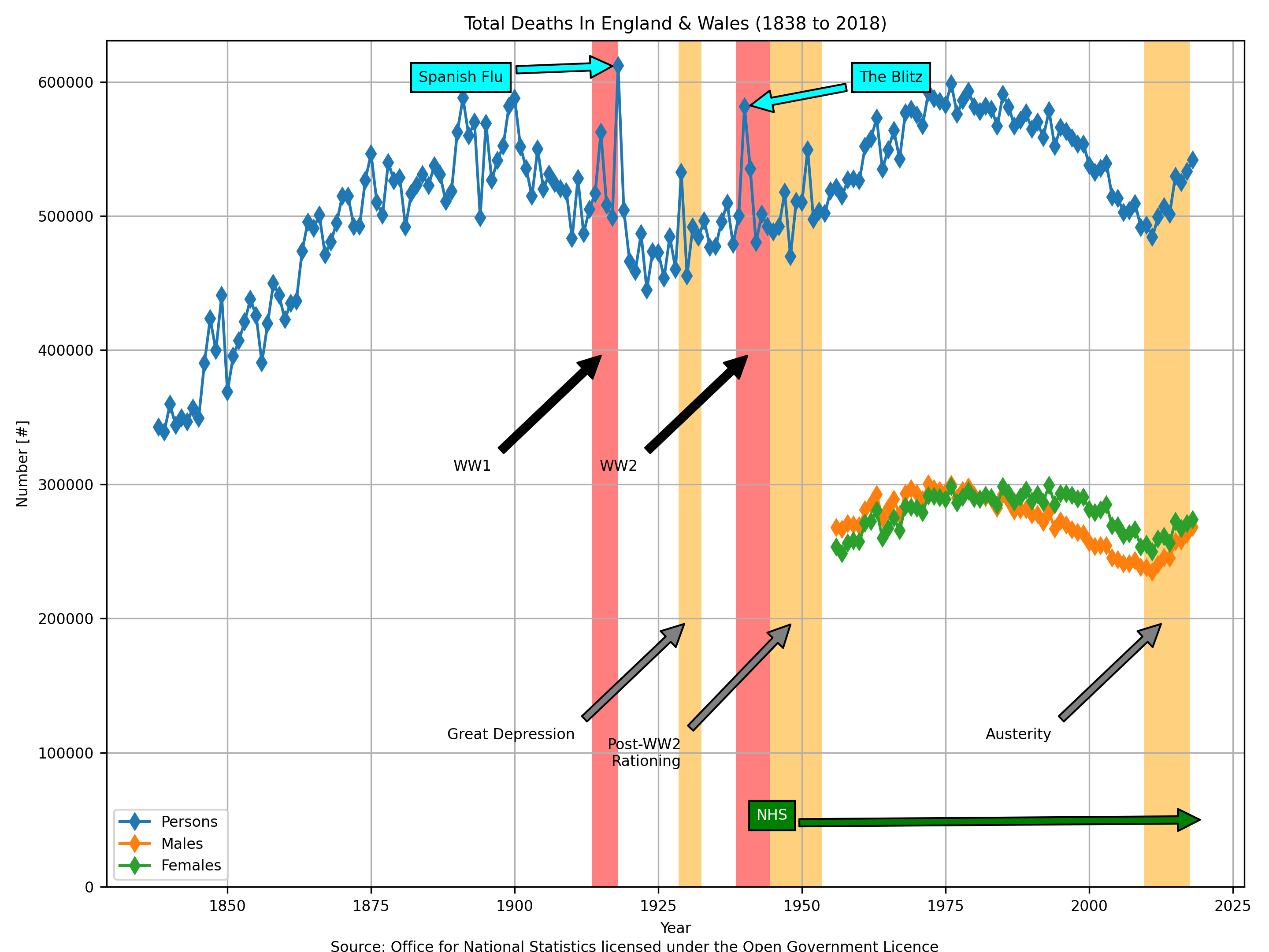
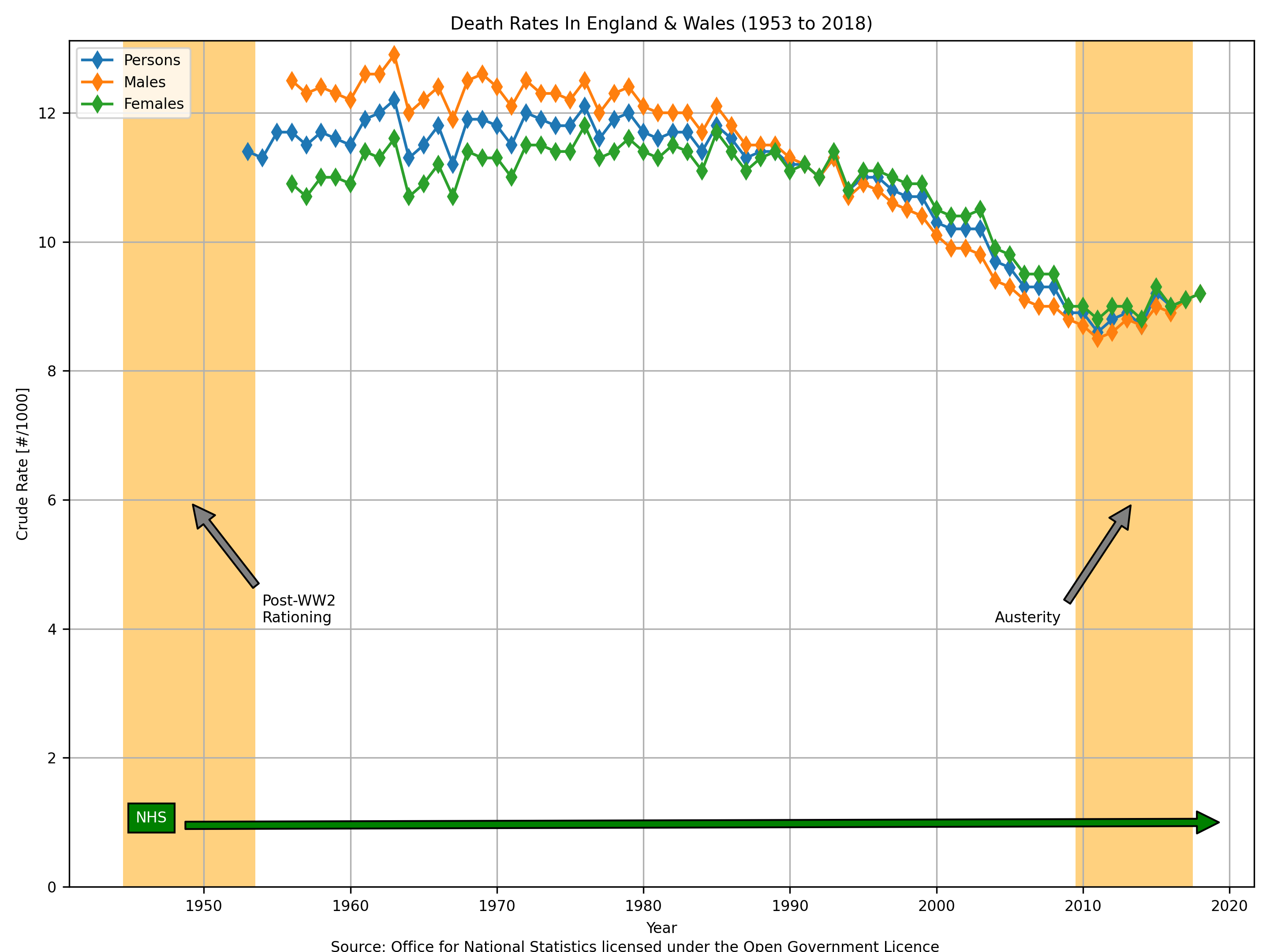
The following plot uses data from “Table 1” within “referencetablesfinalv22.xlsx” (source: Office for National Statistics licensed under the Open Government Licence).

I think that the most basic thing to observe here first of all is that in 2018 in England and Wales 541,589 people died - which is 1,484 people per day, which is just a tiny little bit more than 1 death every minute.
In the above plot I have taken the liberty of annotating some historic events. Please use caution here though and heed the warning that I included in the top of this blog post: correlation ≠ causation.
- I am not saying that the Government’s policy of austerity (from 22th June 2010 to 29th October 2018) caused an extra 57,000 people to die each year by 2018 (from 484,367 by the end of 2011 to 541,589 by the end of 2018, an increase of 11.81%), but rather that it is simply coincident.
- The year with the highest total number of deaths in England and Wales ever was 1918 (at 611,861), which happened to coincide with the outbreak of Spanish Flu.
Finally, I will point out that these are simply “total deaths” and that the numbers may simply be changing because the population of England and Wales went up and down too. Later on I will show some “total death rate” statistics which normalise out the fluctuating population.
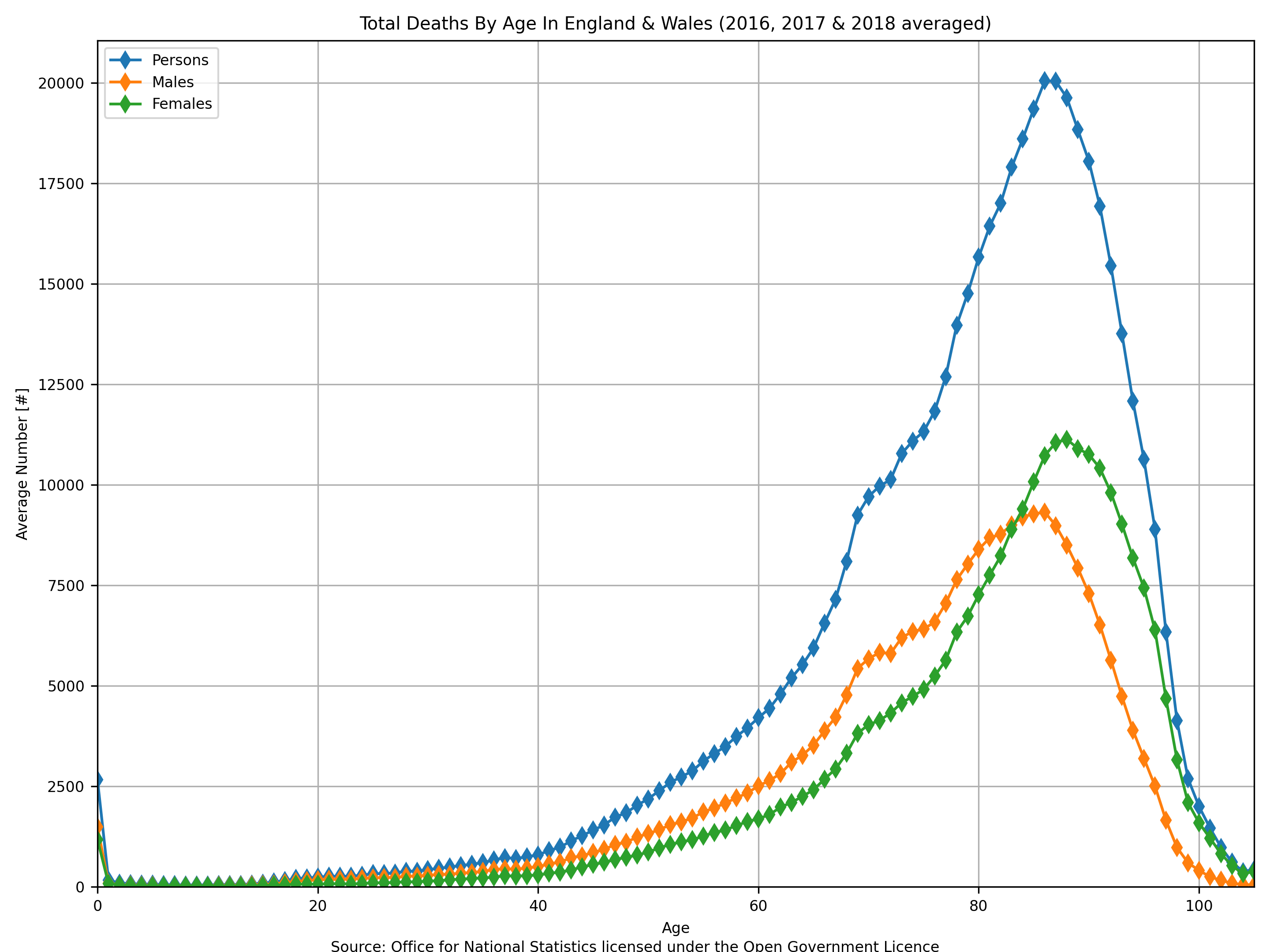
§1.1 Total Deaths By Age
Enough people die in England and Wales each year that it is possible to get a statistically significant distribution of the age that people were when they died. This is not the same thing as life expectancy. Life expectancy is how long a person is expected to live; the distribution of peoples’ ages at death is only equal to life expectancy if life expectancy never changes due to societal changes and if at the start of the year there were the same number of people of all ages in your population (i.e., even if life expectancy is 80 years then most people who die in a year might be 20 years old if most of the people in your population at the beginning of the year were 20 years old).
The following plot uses data from “Table 4” and “Table 5” within “referencetablesfinalv22.xlsx” (source: Office for National Statistics licensed under the Open Government Licence).

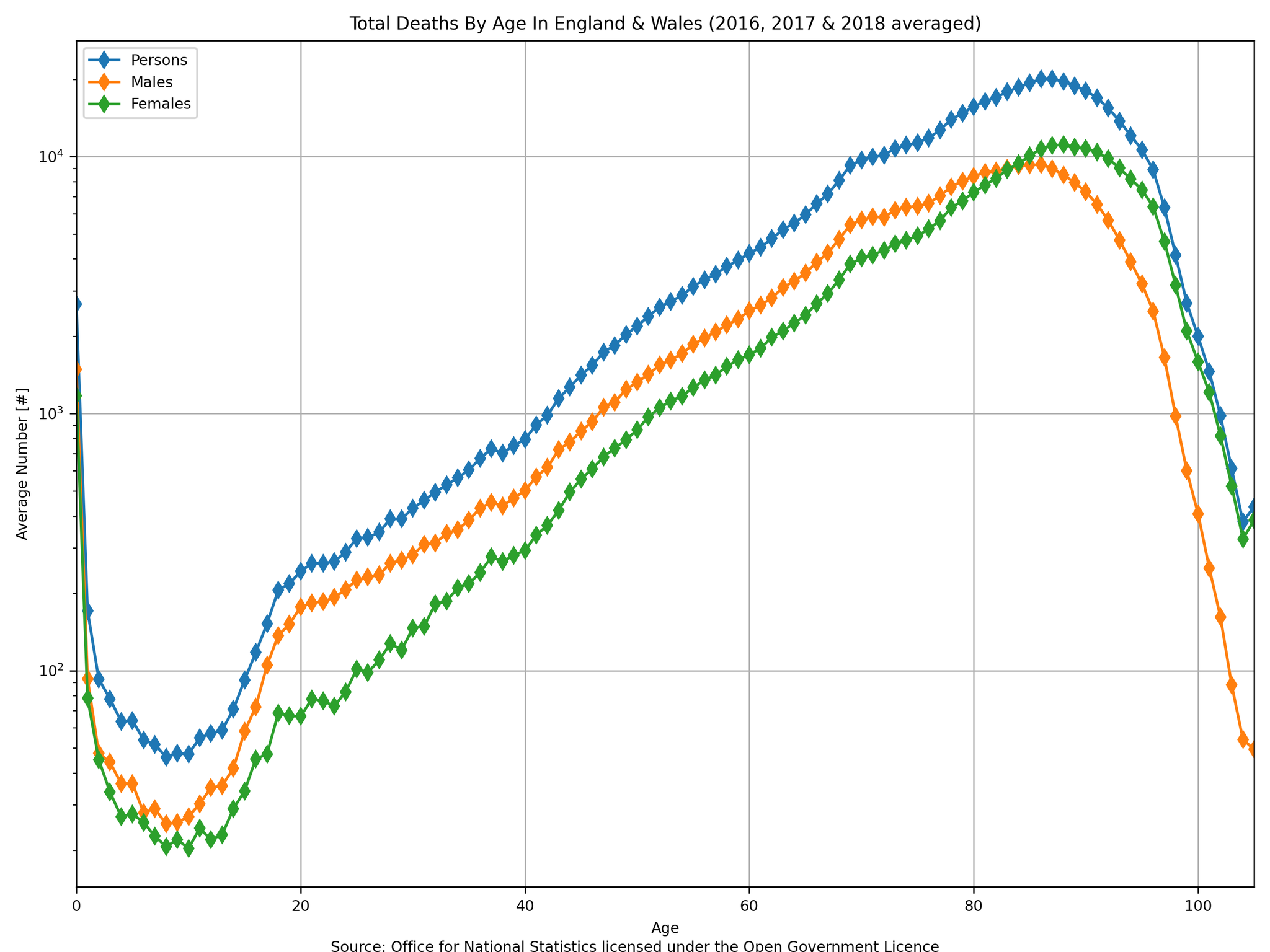
The “modal male age at death” is 86 years old and the “modal female age at death” is 88 years old. This tells you in simple terms that the most common age for a person to die (averaged over 2016, 2017 and 2018) was 86 years old for a man and 88 years old for a woman.
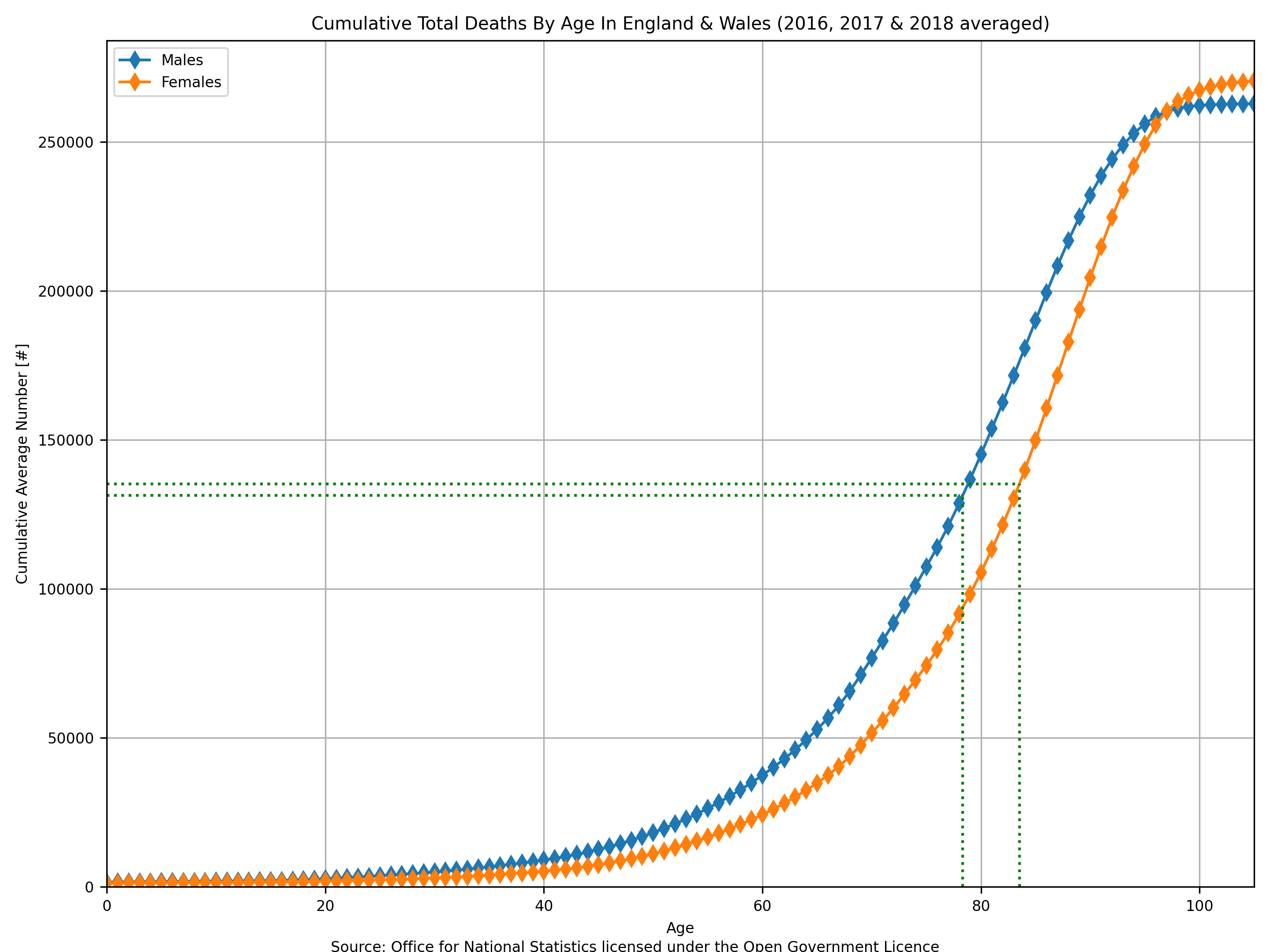
The modal average, in my opinion, is not the most useful parameter for describing this particular parameter. The distribution can be re-plotted as a cumulative distribution which allows the median average to be obtained easily.

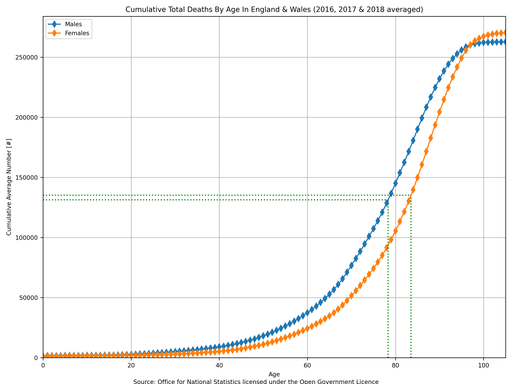
The “median male age at death” is 78.3 years old and the “median female age at death” is 83.5 years old (as indicated by the dashed green lines which intersect 50% in the above plot). This tells you in simple terms that (averaged over 2016, 2017 and 2018) half of the deaths were above 78.3 years old for men and above 83.5 years old for women.
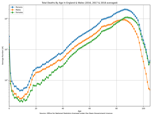
Finally, there is a rather sad aspect of these statistics that you may have missed in the basic age distribution plot earlier: infant deaths. By re-plotting the data on a logarithmic y-axis it can be clearly shown that just as many babies died in their first year as 50 year olds who died (averaged over 2016, 2017 and 2018).

§2 Death Rates
As mentioned earlier, whilst the plots of total deaths are interesting they may give incorrect impressions of what is actually happening in society because the numbers are sensitive to general changes in population, such as emigration and immigration. To solve this issue the ONS produces “total death rate” numbers, which unfortunately only go back to 1953 (presumably because they did not accurately estimate the total England and Wales population before then?).
The following plot uses data from “Table 1” within “referencetablesfinalv22.xlsx” (source: Office for National Statistics licensed under the Open Government Licence).

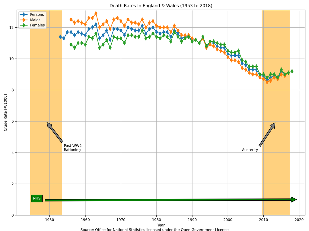
The increase in deaths during the period of austerity that was observed earlier appears to have been, in part, due to an increasing population because the increasing gradient in the above plot is less pronounced that the earlier plot (of total deaths). In both plots the point of inflection is 2011; the increase in the total number of deaths was 11.81% whereas the increase in the total death rate was only 6.98% - thus telling you that 4.51% out of that 11.81% increase in deaths was simply due to an increase in the underlying population (1.0698 × 1.0451 = 1.1181).
The above plot is concerning though because it confirms what was observed in the earlier one: death rates were in a constant decline from approximately 1980 onwards and something occurred between 2010 and 2012 that caused this downward trend to reverse and actually increase for the first time since records began (for the “total death rate” parameter). Again, this might be a little misleading too: if your population contained a lot of 40 year olds in 1970 then it would contain a lot of 80 year olds in 2010 and a lot of them would begin to die around 2010. The uptick in death rate from 2011 might just be a consequence of the UK having an ageing population - our population distribution is top-heavy (see the excellent ONS article on “Living longer: how our population is changing and why it matters”).
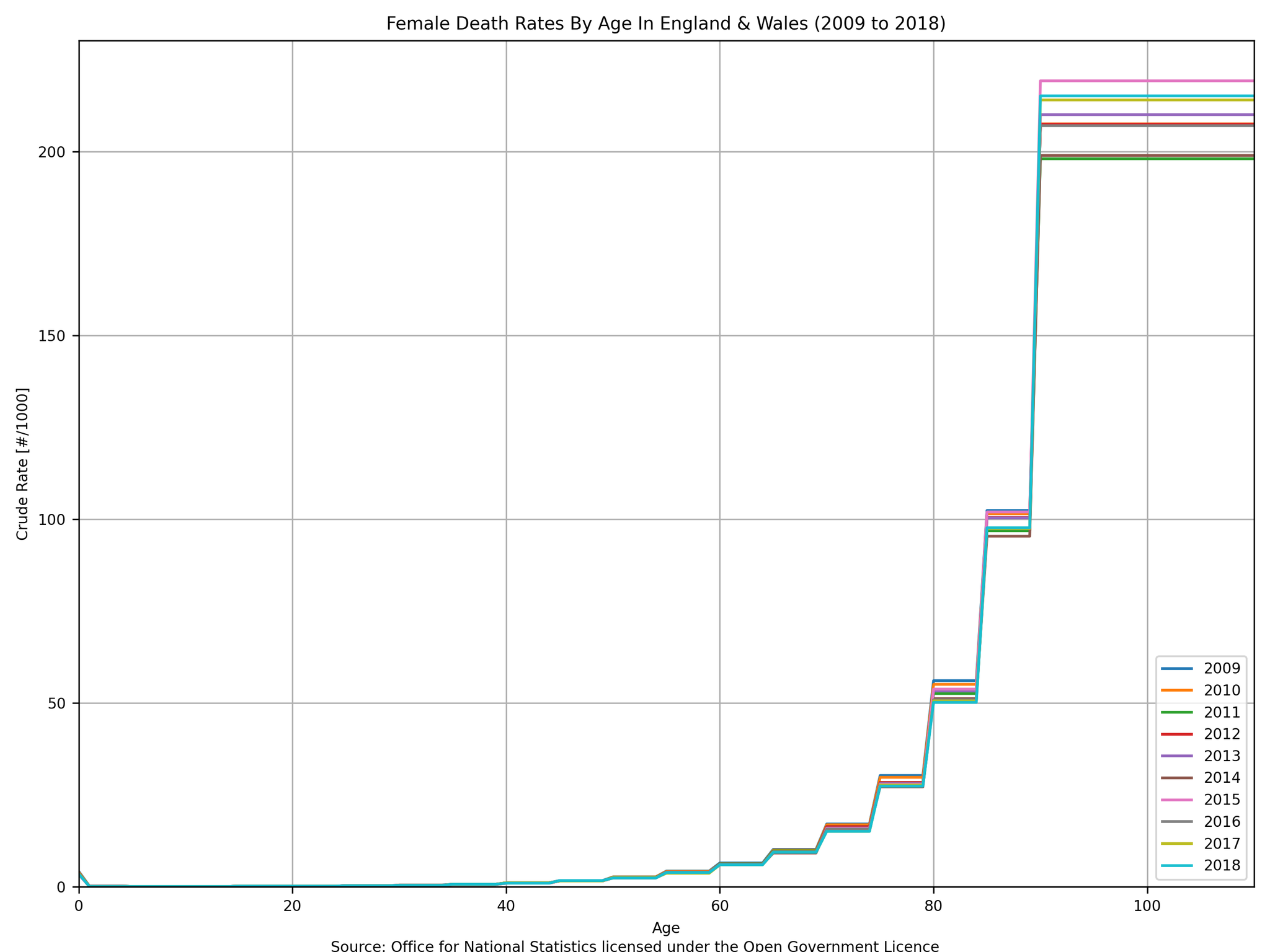
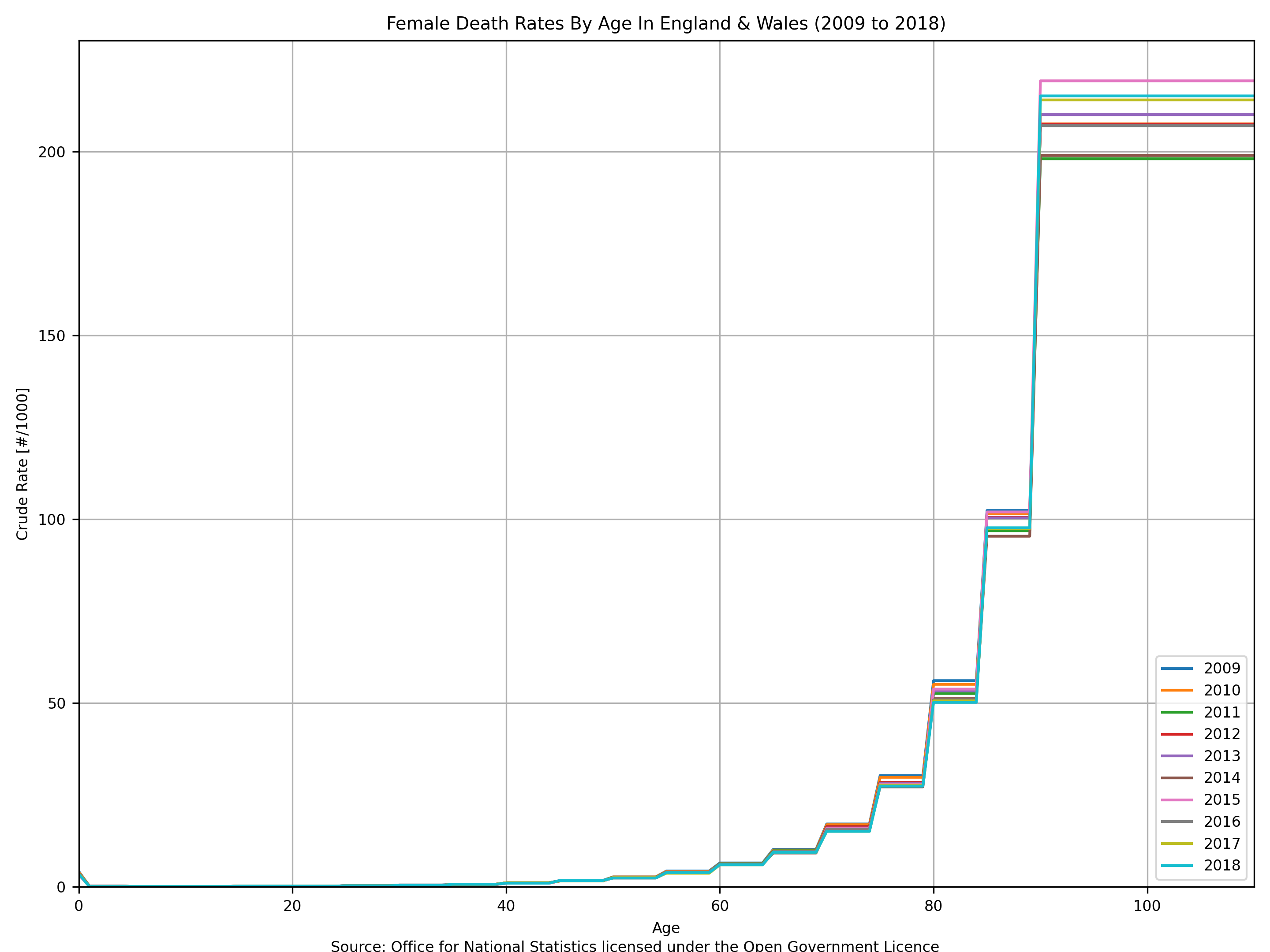
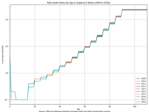
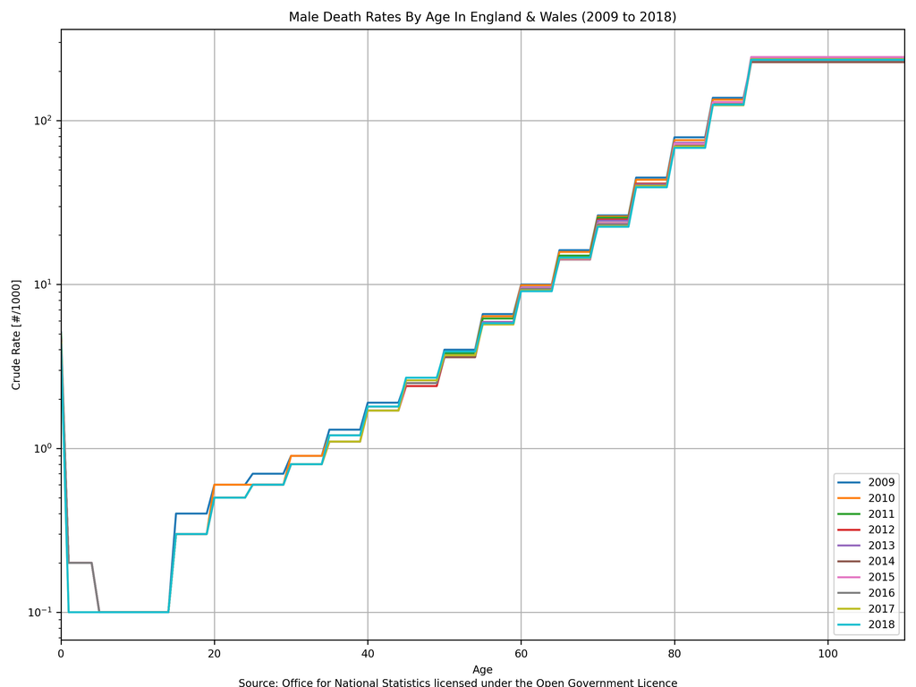
§2.1 Death Rates By Age
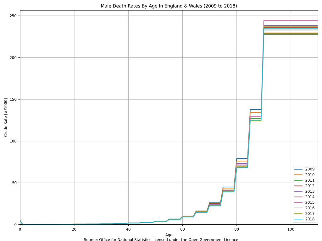
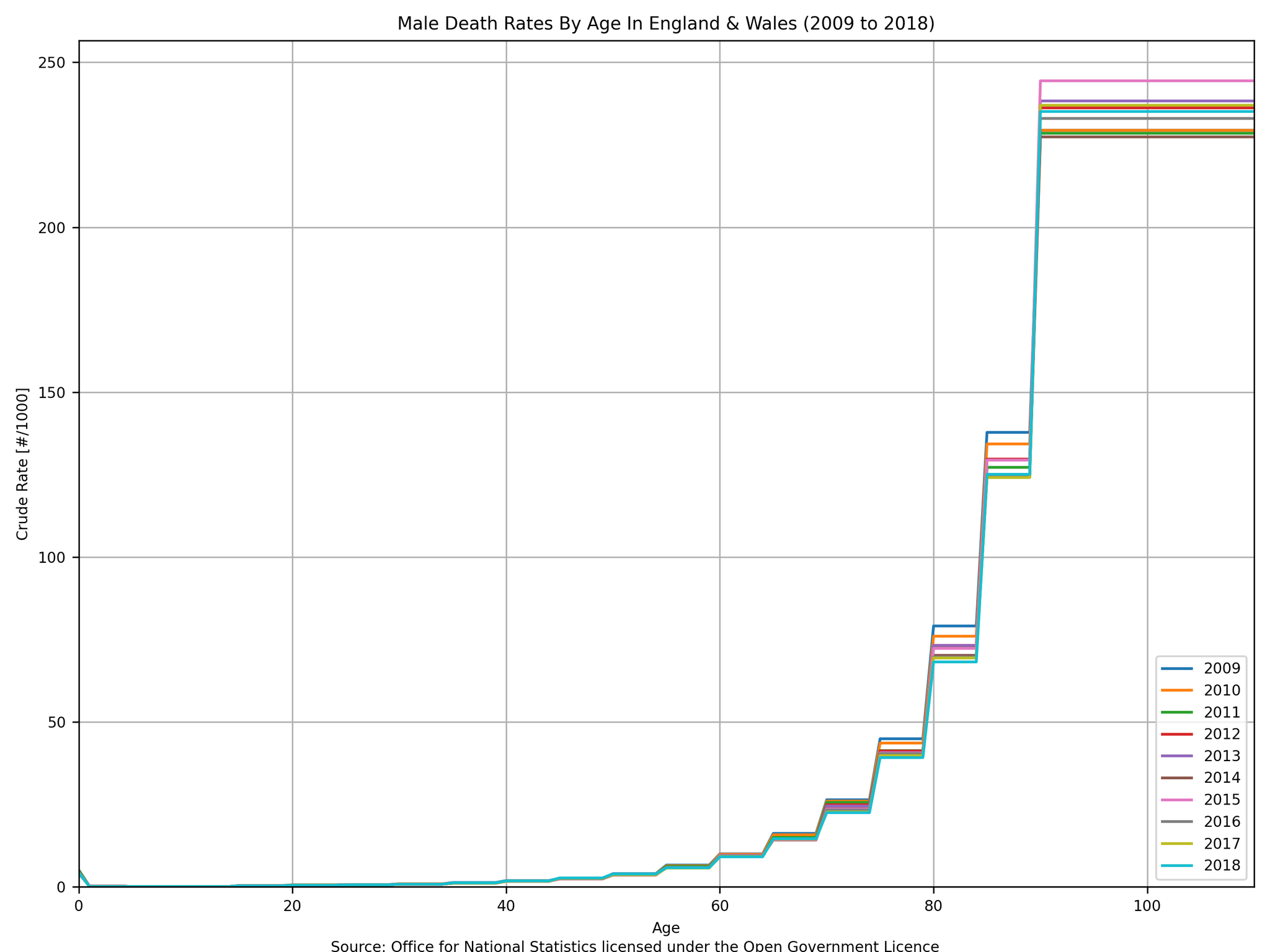
To dig further in to whether the 6.98% increase in total death rate from 2011 to 2018 was due to either an ageing population or an actual increase in the overall death rate then the death rates by age must be studied. These are plotted below on linear and on logarithmic axes for both men and women.
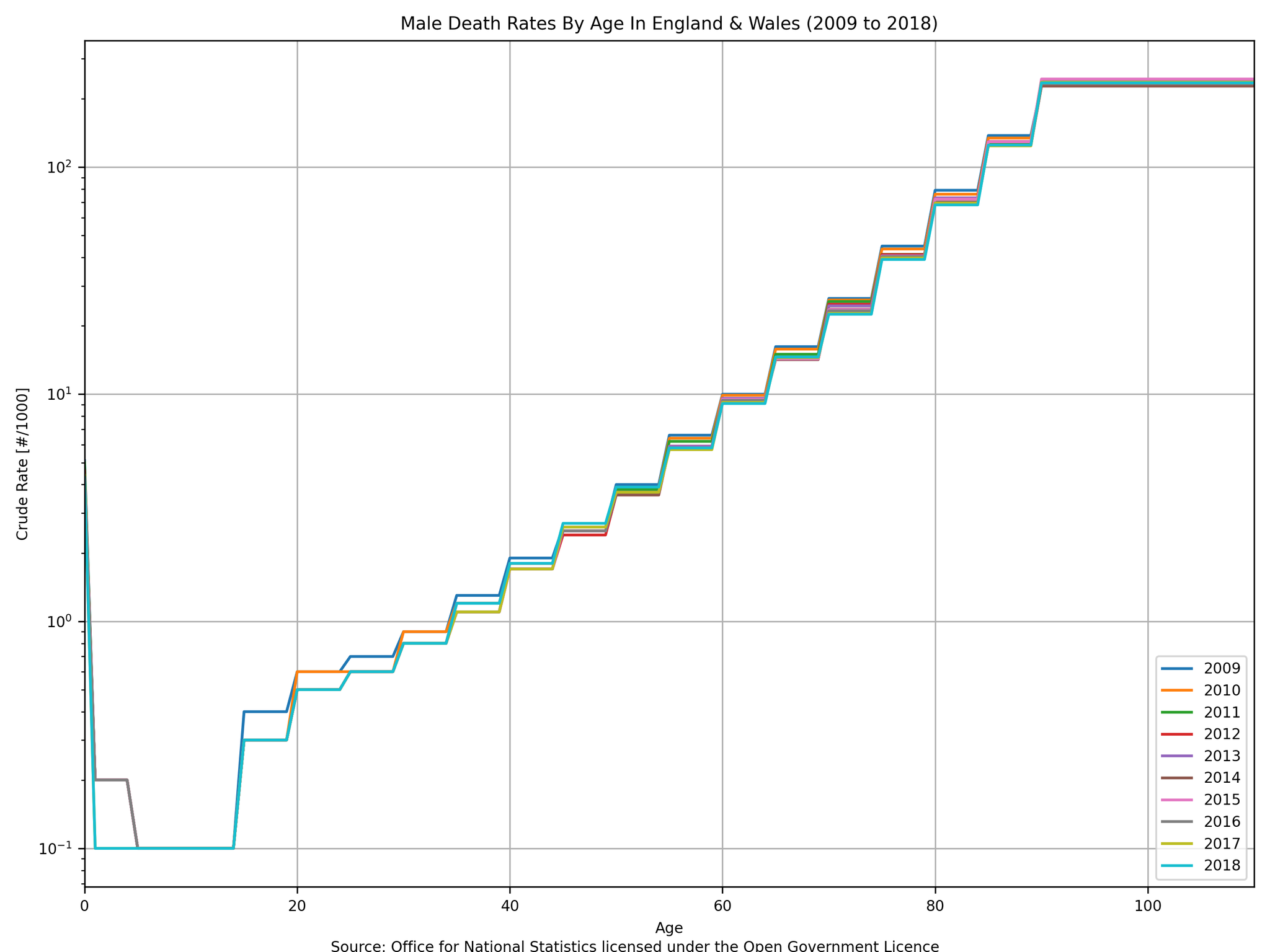
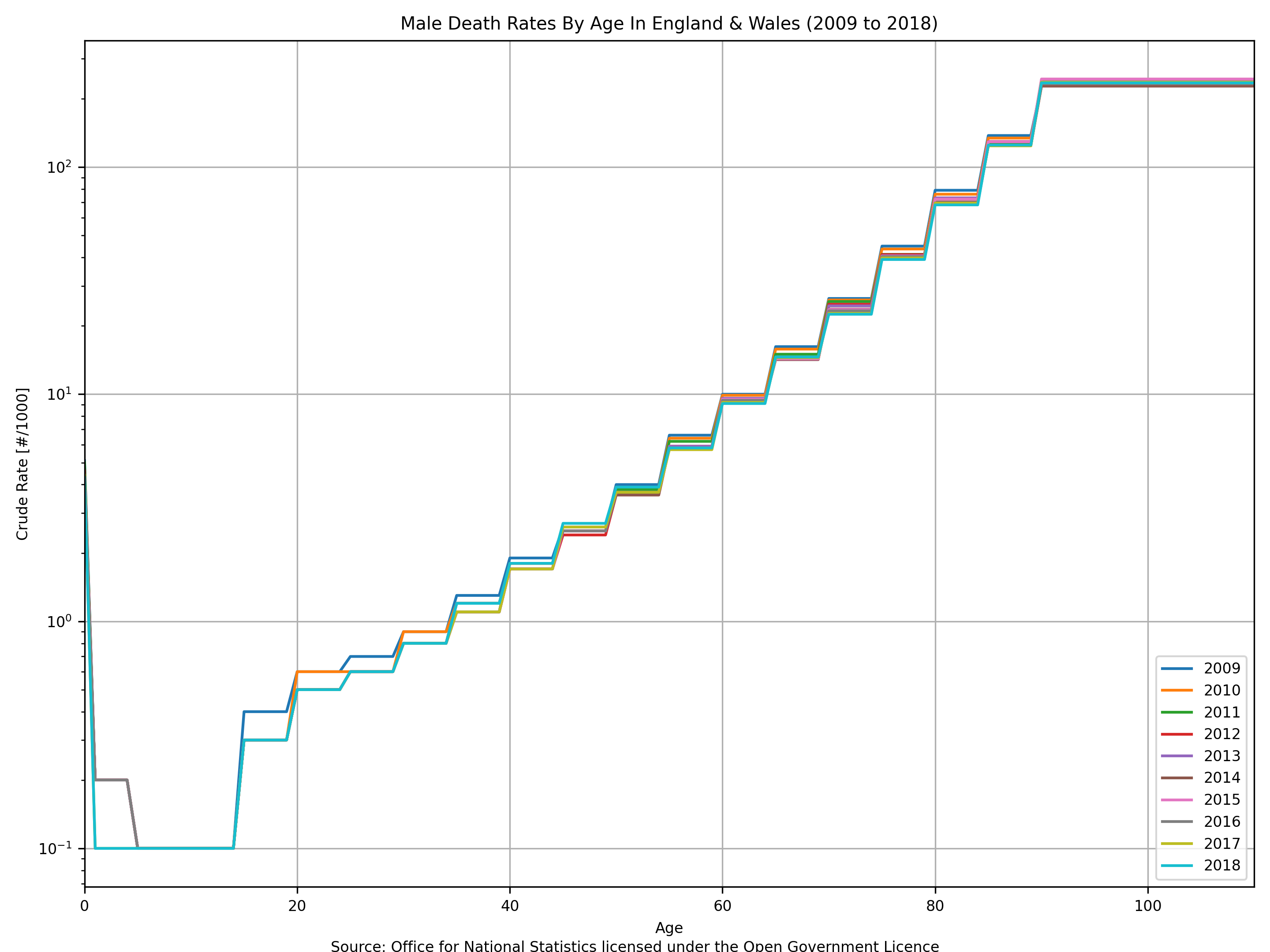
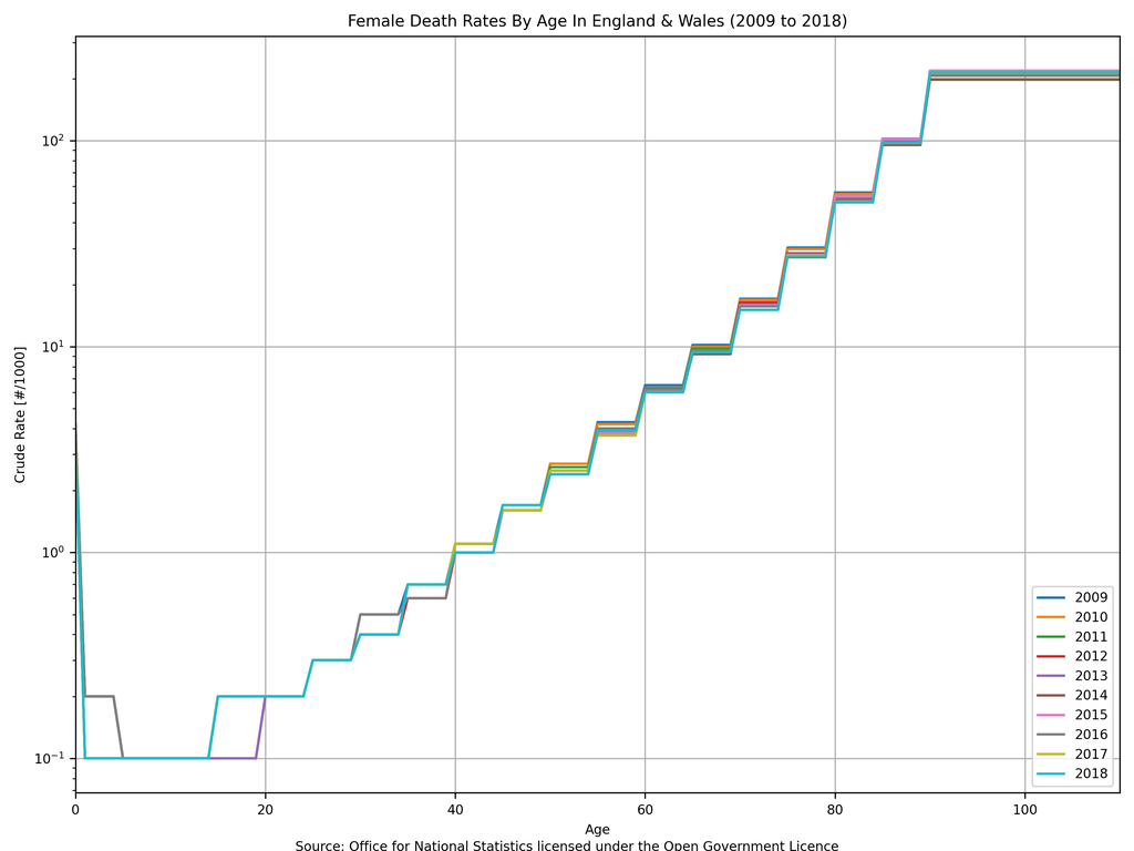
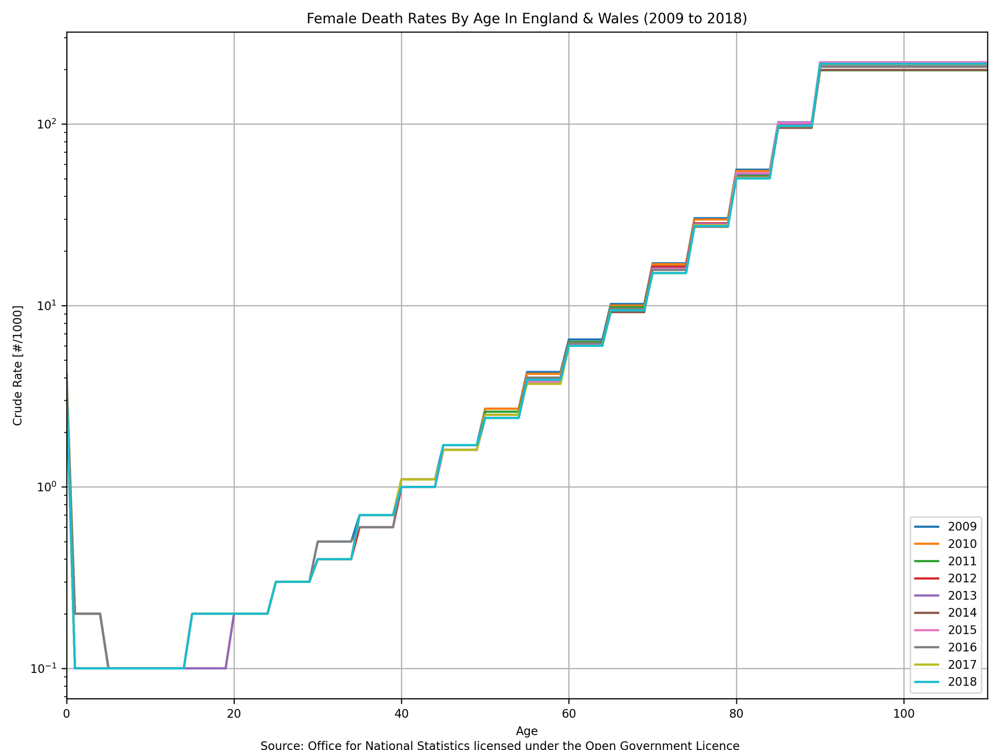
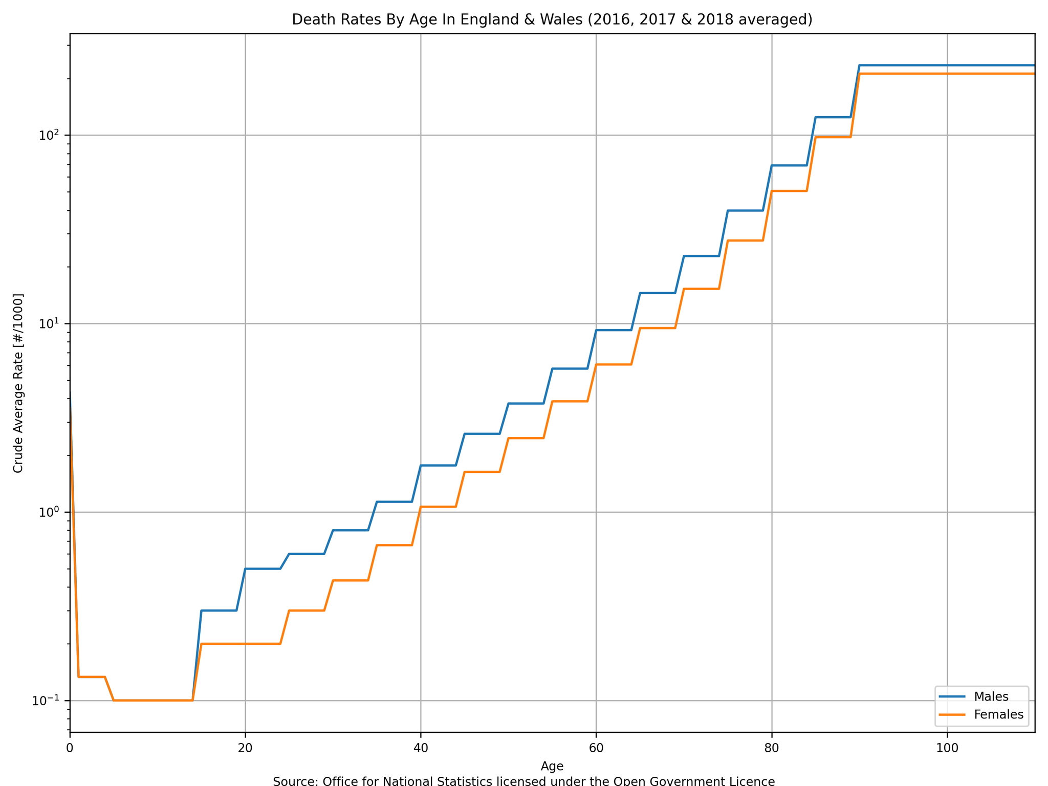
The following plots use data from “Table 3” within “referencetablesfinalv22.xlsx” (source: Office for National Statistics licensed under the Open Government Licence).


Personally, I believe that there is a lot of noise in these numbers and that broadly speaking there does not appear to be any general trend (either up or down) in death rates by age from 2009 to 2018. Therefore, it is my interpretation that the unexplained 6.98% increase in total death rate is consistent with an ageing population and that there does not appear to have been an event (or series of events) between 2009 and 2018 that caused any significant change to the death rate for different age groups. In short: the political policy of “austerity” did not cause more people to die - it is more likely that it was an ageing population coinciding with net immigration during the period of austerity. More simply: the death rate increased not because life got worse but because people grew up and moved from one age bracket to another one.
Given that the above data is very noisy without any overall trends then it seems fair to average different years together to obtain an “average death rate by age” curve, which is shown below on both linear and logarithmic axes.

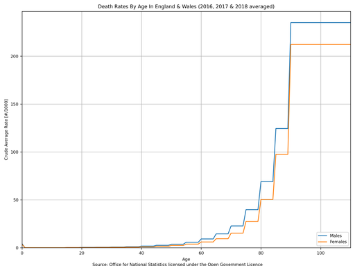
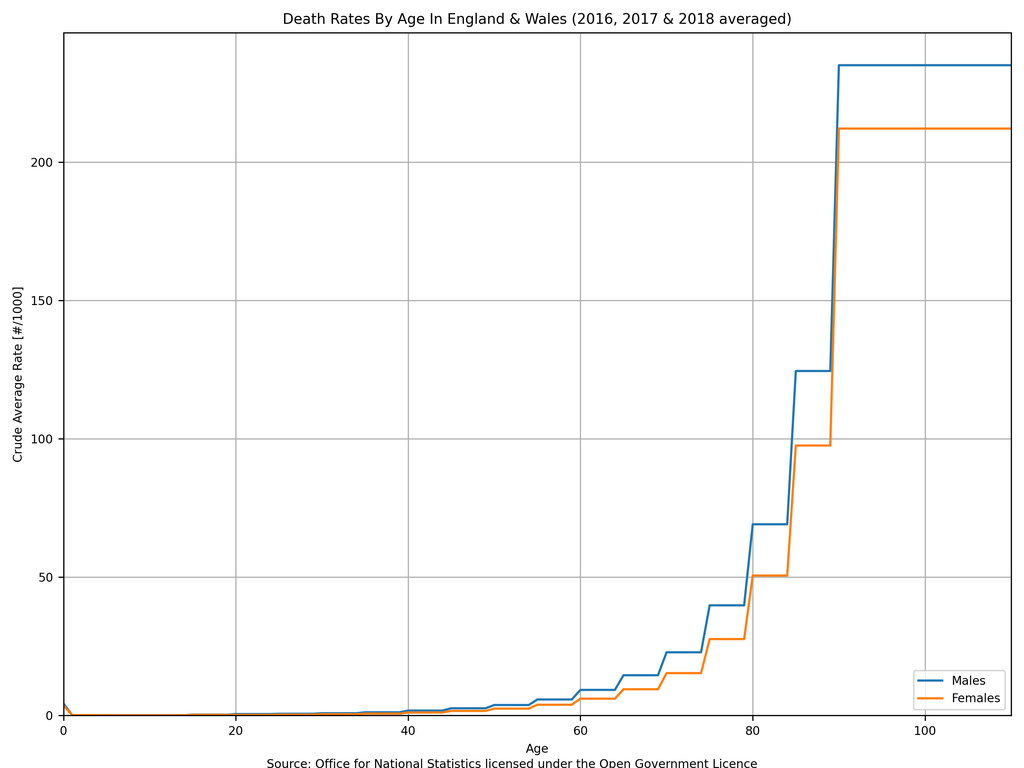
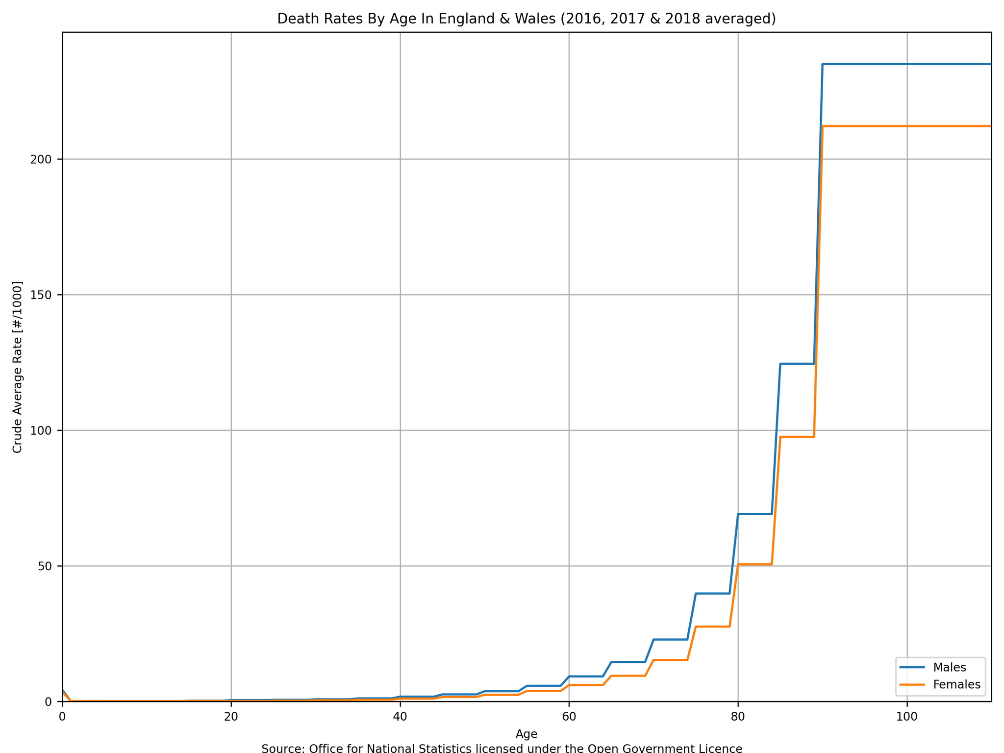

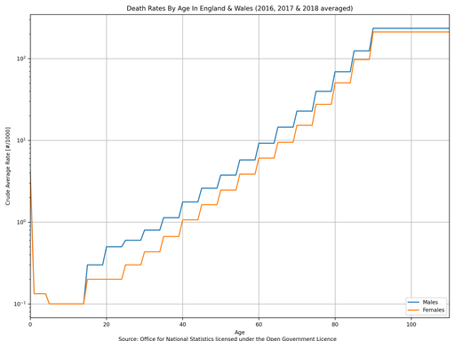
These curves are very interesting because it allows an estimation of life expectancy to be made …
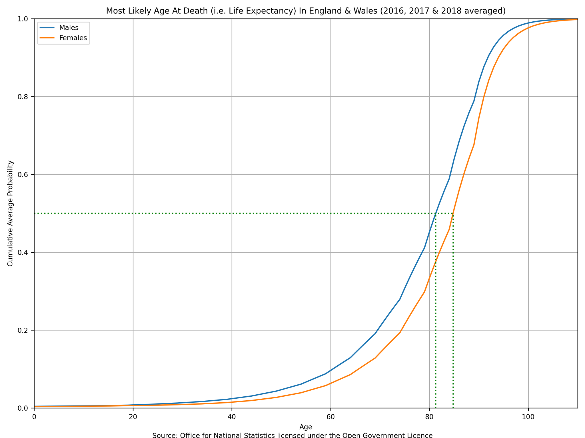
§2.2 Life Expectancy (i.e. Most Likely Age At Death)
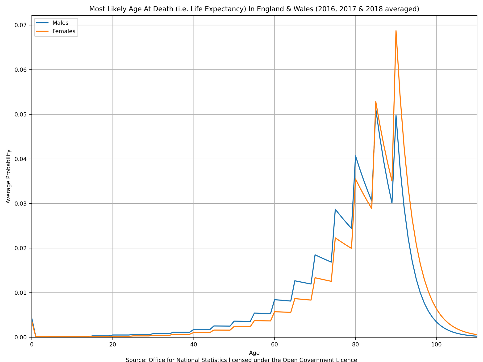
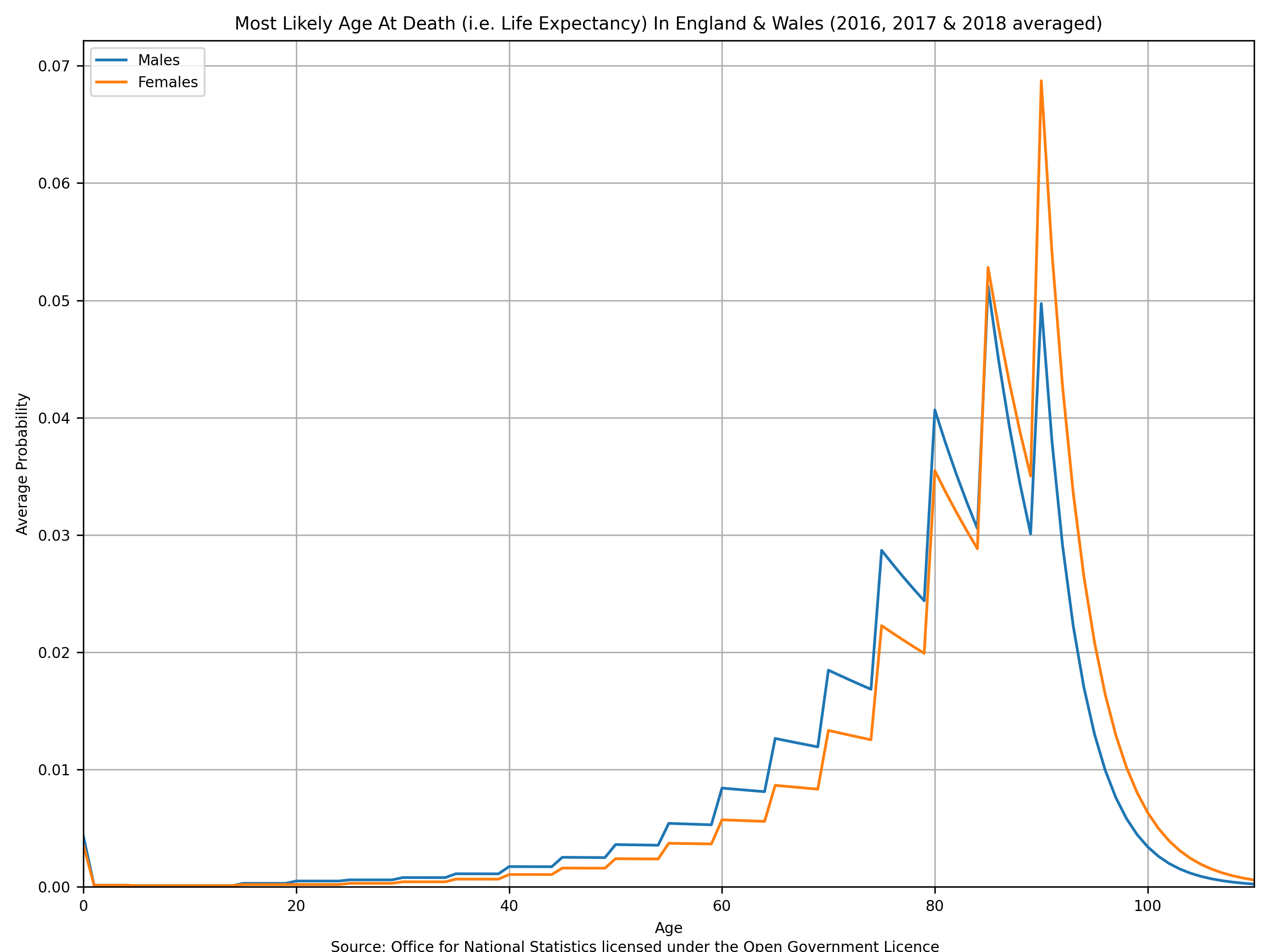
The death rates discussed above are, in effect, “the probability of a 20 year old person dying whilst they are 20 years old”. If you want to know “what is the probability of a person dying when they are 20 years old” then it is simply the “the probability of a person not dying from 0 years old to 19 years old” × “the probability of a 20 year old person dying whilst they are 20 years old”. This logic allows a simple numerical series to be created and a distribution of “most likely age at death”, i.e. “life expectancy”, to be estimated. This method assumes that the “death rate by age” does not change during a person’s life.

The estimated “median male age at death” is 81.3 years old and the “median female age at death” is 84.8 years old (as indicated by the dashed green lines which intersect 50% in the above plot). If you wanted to really depress yourself, the above plot can trivially be used to answer questions like:
having reached 50 years old, what is the probability that a person will die before they reach 60 years old?
my State Pension age is 68 years old, what is the probability that I will make it to retirement?
if I make it to 68 years old, how many years of retirement will I have?
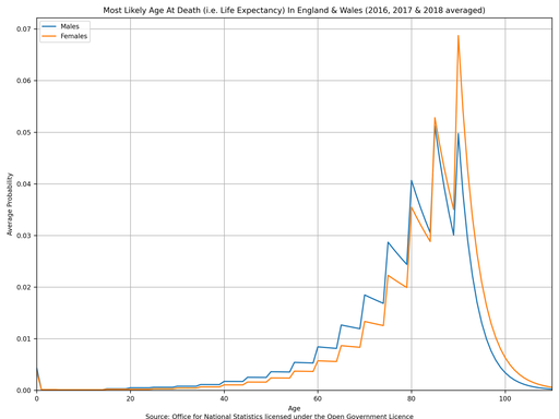
Unfortunately, due to the coarseness of the original dataset, the probability density function has lots of saw-teeth and therefore looks awful. Perhaps you can find the death rate dataset broken down by individual years (rather than 5 year groups) somewhere else on the ONS website and let me know?

A word of caution: these plots obviously assume that the death rate as a function of age is constant - that your probability of death at 60 years old is not affected by what the probability of death at 20 years old was 40 years ago. If I could find more historic “death rate by age” data from the ONS then I could improve this approximation and make a plot of “most likely age at death of a person born in 1950” (for example) instead.
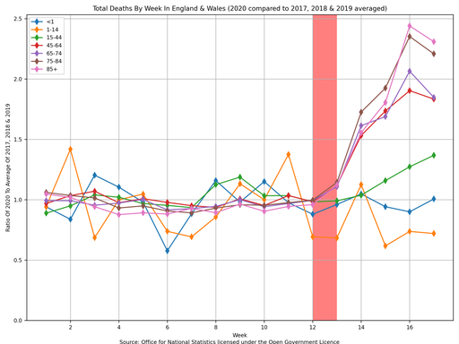
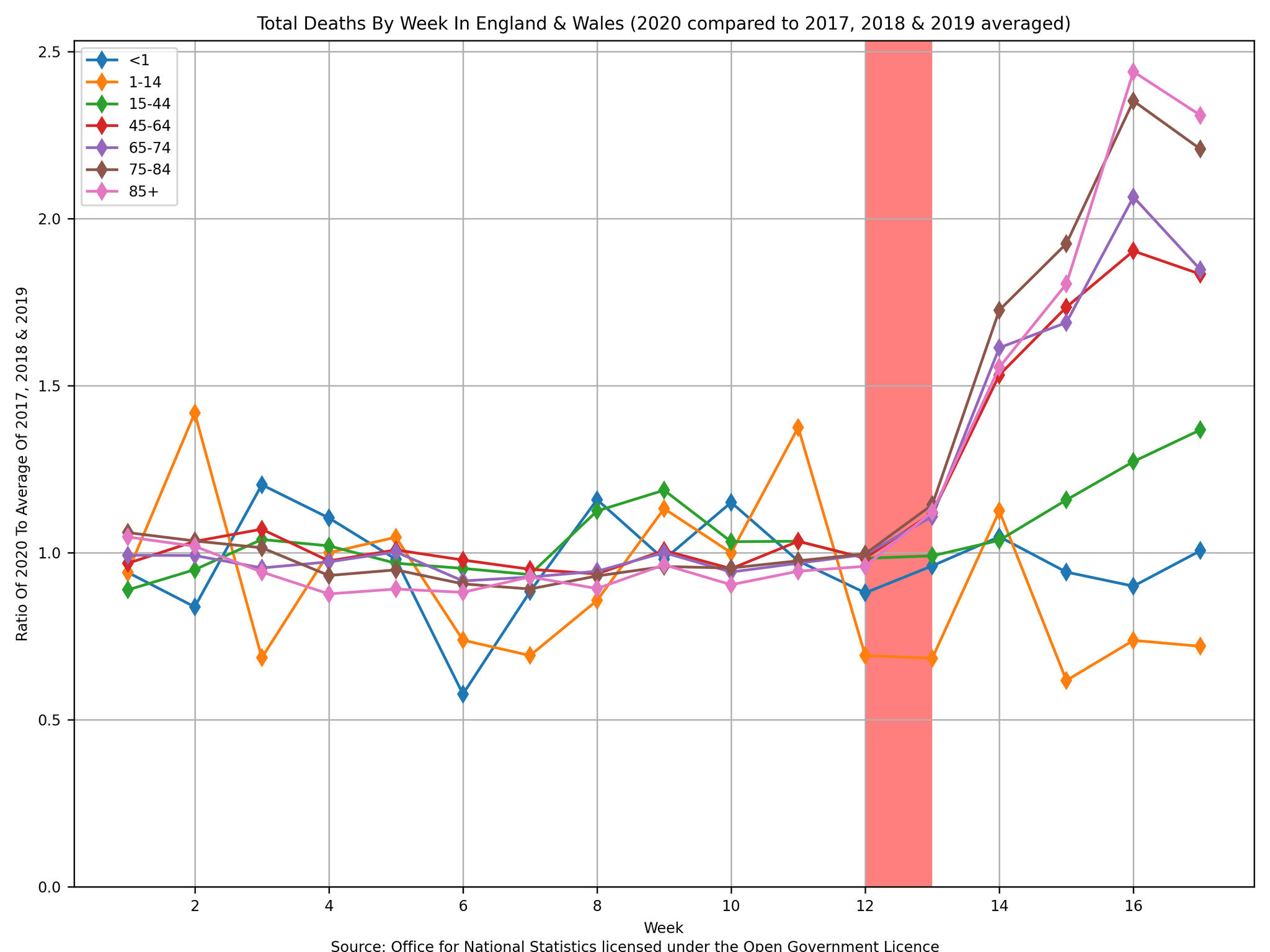
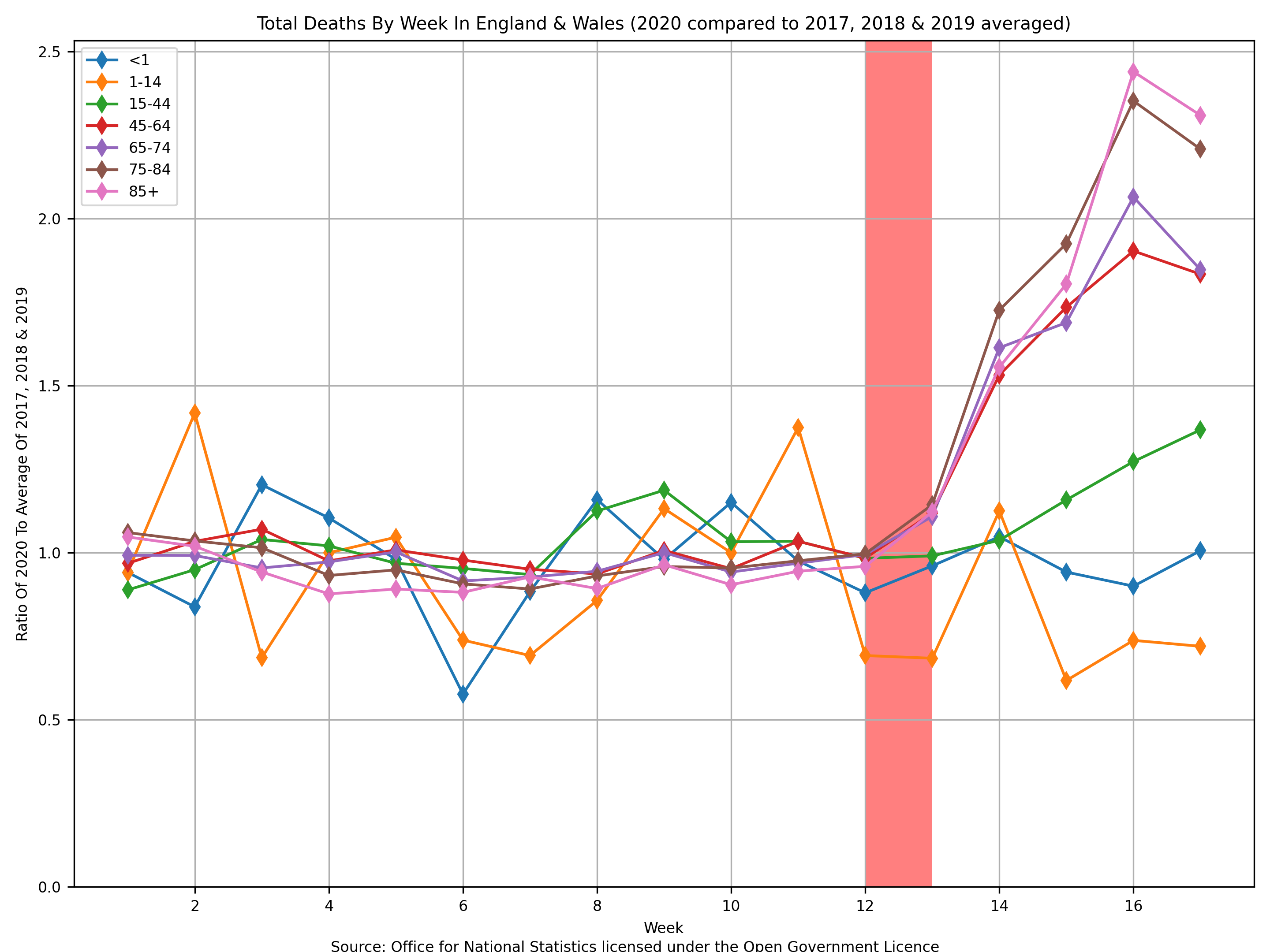
§3 Total Deaths By Week
The final parameter that I wish to discuss is the most controversial and the most relevant to us at this time: the “weekly deaths”. The ONS provides the Deaths registered weekly in England and Wales dataset, which contains a running total of the number of deaths in England and Wales for each week in a year.
The following plot uses data from “Weekly figures 2017” within “publishedweek522017.xlsx”, “Weekly figures 2018” within “publishedweek522018withupdatedrespiratoryrow.xlsx”, “Weekly figures 2019” within “publishedweek522019.xlsx” and “Weekly figures 2020” within “publishedweek172020.xlsx” (source: Office for National Statistics licensed under the Open Government Licence).

In the above plot I have taken the liberty of highlighting the week when the UK entered lockdown. Again, please use caution here though and heed the warning that I included in the top of this blog post: correlation ≠ causation. There are a few things to observe from the above plot:
- There is a lot of noise in the two youngest age groups because not a lot of people in those age groups die anyway (therefore the √n error is larger as a percentage).
- The four oldest age groups show a significant increase in the number of weekly deaths recently.
- The peak of the weekly deaths for the four oldest age groups occurred 3 or 4 weeks after the UK entered lockdown.
- There might be an increase in the weekly deaths for the “15 to 44” age group which is lagging behind the four oldest age groups. If so, then that implies that either the mechanism for the increase in deaths is different (maybe coronavirus takes long to kill a younger person or maybe it is not coronavirus that is killing them) or the start point of the cause was different (maybe younger people have been breaking the lockdown or maybe the older people voluntarily locked themselves down before the Government announced the policy).
- So far, touch wood, there is no evidence to say that there is any increase in deaths whatsoever for anyone under 15 years old - it is just statistical noise. If you averaged over more previous years then you would make the line have less noise but you will still be susceptible to noise from this year’s data. Only by looking back on 2020 from, say, 2025 will we be able to say with any sort of confidence (assuming things do not change going forward).
§4 Observations
If you have got this far reading my blog post, then: thank you
. Overall, I have a few summarising observations to make:
- Everybody dies.
- There is still a reasonably high chance that a person will not make it to their 10th birthday.
- If a person does make it to their 10th birthday then each successive year they are more likely to die than in the previous year.
- Most people who die are old (over 60 years old).
- The only reason the total number of deaths of very old people (over 86 years old for males and over 88 years old for females) drops is because there are fewer and fewer of them left each year to die.
- If you are male and make it to 82 years old then you are above average and luckier than most (see above: median male age at death is 81.3 years old).
- If you are female and make it to 85 years old then you are above average and luckier than most (see above: median female age at death is 84.8 years old).
- There has been a recent increase in deaths of people 45 years old or older, which is now dropping.
- There has been no recent increase in deaths for people below 15 years old whatsoever.
- There might have been a recent increase in deaths of people between 15 years old and 45 years old, but it is hard to tell due to the noise in the data. Given that it is a steady rise, rather than a lot of week-to-week variations, then I think that there probably has been an increase in this age group too. It is not dropping … yet.
- Time will tell if people’s life expectancies have been significantly shortened or if most of the extra people who have recently died were going to die anyway during next winter’s flu season, for example.
- Time will also tell us what the lasting economic consequences of our choices are … only hindsight will tell us if this has been worth it.
Finally, I thought that I would end on a modern classic web comic:
