Post-COVID-19 Update On Death Statistics For England And Wales
About two and a half years ago, I wrote a blog post about some death statistics for England and Wales as COVID-19 started to kick-off, which I then followed up about a year ago with a mid-COVID-19 update. Now that another year has passed, I decided to revisit the subject and update my plots to include the recently released 2021 death statistics.
The statistics that I am using in the following discussion have all come from the Office for National Statistics (ONS). The single specific data source (fetched at approximately 11AM on 14th August 2022) that I have used is:
- Deaths registered in England and Wales (which provides a link to download “dr2021.xlsx” - which is used throughout this post)
As before, a word of caution: just because I can find an historical event that aligns with a peak or a trough on a curve does not necessarily mean that the historical event caused the peak or trough. Correlation ≠ Causation
; see Spurious Correlations for some hilarious examples that underscore this statement. The rest of this blog post is arranged like:
§1 Total Deaths
The plot below shows the total number of deaths in England and Wales since 1838. As a reminder, 1918 was the most deadly year with 611,861 deaths. 2020 was only the second year on record where the total number of deaths exceeded 600,000 (at 607,922 deaths).
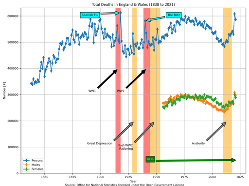
It is unequivocal that something occurred in 2020 to result in a significant increase in the total number of deaths in England and Wales. As in my previous discussions though, the above plot is largely pointless as it is susceptible to underlying population changes (because it is a simple total count).
§2 Crude Mortality Rate
A better metric to describe deaths in England and Wales is a crude mortality rate, i.e., “the total number of deaths” divided by “the total population”, which is shown below.
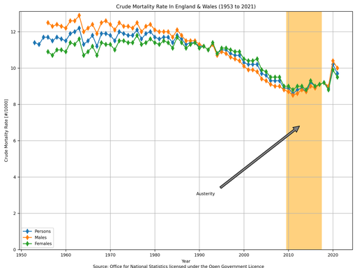
For example, in the first plot, the total number of deaths increased by 11.81% during austerity; however, in the second plot, the crude mortality rate only increased by 6.98%. This indicates that roughly half of the increase in the total number of deaths was simply due to an increasing population.
More interestingly, 2020 is no longer as severe. The mortality rate in 2020 is the same as what it was in 2003, and it is lower than any value in the 20th Century (on record).
§3 Age-Standardised Mortality Rate
During my previous discussions, I talked about how the UK has an ageing population, and how the crude mortality rates for each age group did not increase during austerity, leading to the conclusion that the increase in the overall crude mortality rate is simply due to there being more old people in the population. The ONS produce a mortality rate statistic for a “standard” population, so as to not be susceptible to an ageing population: this is shown below.
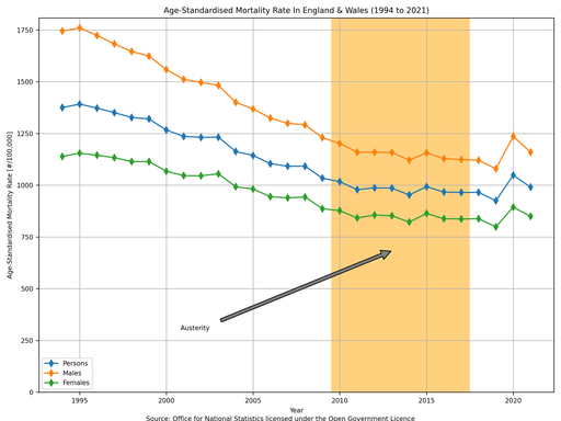
During austerity, the age-standardised mortality rate actually fell by 1.35%.
Again, 2020 is no longer as severe. The age-standardised mortality rate in 2020 is between the values for 2008 and 2009, and it is lower than any value in the 20th Century (on record).
§4 Excess Deaths
An awful lot of the discussion about COVID-19 in the past year or two has centred on the idea of “excess deaths”. This statistic is quite simple: what is the difference between the current number of deaths and the arithmetic mean of the number of deaths for the preceding 5 years?
As this uses the total number of deaths, then it is susceptible to both a changing population size and an ageing population. Hopefully though, as 5 years is a fairly small window to average over then it shouldn’t be overly susceptible. I have gone through and calculated it for every year since the mid-19th Century, shown below as both absolute numbers and relative ratios.
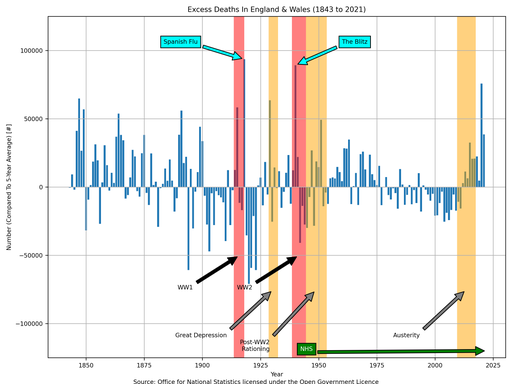
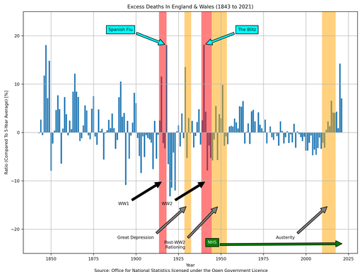
Clearly, 2020 is an outlier; however, it is not as much of an outlier as one might think. 2020 was +14.3%, but 2015 was +6.6% and no-one batted an eyelid (just think about that for a moment…). 2020 was the highest for excess deaths since 1940. Furthermore, all years since 2012 have been positive (due to the ageing population). Therefore, whilst +14.3% is high one would not have had the expectation that it would’ve been +0% for 2020 had COVID-19 not happened.
What is also clear from the above plot, is that there have been many years that have had excess deaths in the same ballpark as 2020. The table below lists the top five years (absolutely), with my very crude attempt to find a historical event that correlates with the year (2021 is #13, and is therefore a long way off the bottom of the table).
| Year | Excess Deaths | Correlated With … |
|---|---|---|
| 1918 | +93,639 | … Spanish Flu |
| 1940 | +89,210 | … The Battle Of Britain (and The Blitz) |
| 2020 | +75,845 | … COVID-19 |
| 1847 | +64,788 | … famine? (due to potato failure) |
| 1929 | +63,516 | … Wall Street Crash |
The table below lists the top five years (relatively), with my very crude attempt to find a historical event that correlates with the year (2021 is #21, and is therefore a very long way off the bottom of the table).
| Year | Excess Deaths | Correlated With … |
|---|---|---|
| 1940 | +18.120% | … The Battle Of Britain (and The Blitz) |
| 1847 | +18.071% | … famine? (due to potato failure) |
| 1918 | +18.069% | … Spanish Flu |
| 1849 | +14.817% | … famine? (due to potato failure) |
| 2020 | +14.254% | … COVID-19 |
I think that it is clear that there is a lot of noise in the above plots (especially before WWII), and I am hesitant of correlating the peaks with domestic events.
§5 Observations
If you have got this far reading my blog post, then: thank you
. Overall, I have a few summarising observations to make:
- Everybody dies.
- An unusually large number of people died in England and Wales in 2020 when compared to all official records.
- More people died in England and Wales in 2021 than in recent times, but you only have to go back to 1985 to find a year where more people died (ignoring 2020).
- High crude mortality rates were seen in England and Wales in both 2020 and 2021 when compared to the past 15 years, but they are entirely in keeping with historical values for the late 20th Century.
- A slightly high age-standardised mortality rate was seen in England and Wales in 2020 when compared to the past 10 years, but it was entirely in keeping with historical values for the late 20th Century and early 21st Century.
- A very slightly high age-standardised mortality rate was seen in England and Wales in 2021 when compared to the past 5 years, but it was entirely in keeping with historical values for the late 20th Century and early 21st Century.
- Whilst the crude mortality rate has been climbing since 2011, the age-standardised mortality rate has been dropping since records began in the late 20th Century. This is purely due to the ageing population.
- An unusually large number of excess deaths occurred in England and Wales in both 2020 and 2021 (both absolutely and relatively), but 2021 doesn’t make it into the top 10 for either absolute numbers or relative ratios. However, there have been higher years and the last few years have been consistently positive, thus indicating that our expectations for both 2020 and 2021 should not have been +0% anyway.
- I would love to see some credible rigorous analysis which estimates what the above statistics would’ve been for both 2020 and 2021 had England and Wales not introduced any restrictions whatsoever.
Never forget that:
- The total number of Military deaths for the UK during WWI was 887,858; presumably the vast majority of these occurred outside England and Wales and are therefore not included in the deaths registered in England and Wales.
- The total number of Military deaths for the UK during WWII was 383,700; presumably the vast majority of these occurred outside England and Wales and are therefore not included in the deaths registered in England and Wales.
Both of these events eclipse COVID-19.