Server Summary
metadata
keywords:
published:2015-06-21
updated:2025-11-22
This page contains some basic information about my server: calliope.
IP Addresses Table Host Key Fingerprints Load Average Plot Temperature Plot Disk Usage Plot Firewall Denials Plot Firewall Denials Maps Firewall Denials “Country Of Origin” Table Network Plots Bandwidth Plot ZFS iostat Plot
§1 IP Addresses Table
This table is created using IPs provided by ipecho.net .
§2 Host Key Fingerprints
md5 Fingerprints
ECDSA = a2:1b:f6:fc:79:6e:95:47:b3:12:18:be:77:21:3a:9e
ED25519 = 30:2f:f9:6e:b8:7c:1e:80:a9:4c:49:8a:94:b6:50:a6
RSA = f2:ef:aa:ec:50:e5:a3:31:66:17:f8:df:68:ab:46:97
sha256 Fingerprints
ECDSA = evKF0j6bhtPxoR0OVD0PosjcesClZJvAiHsVGUIsCBQ
ED25519 = i/uulDpWxCOIaKWkmSoCHkFiYsvOGIYaj3+m2zVqQrU
RSA = quBp13l/FRMeJUg2Nrh8mUVV+KY/r1+GIAuncjBIocE
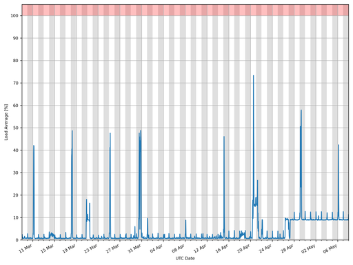
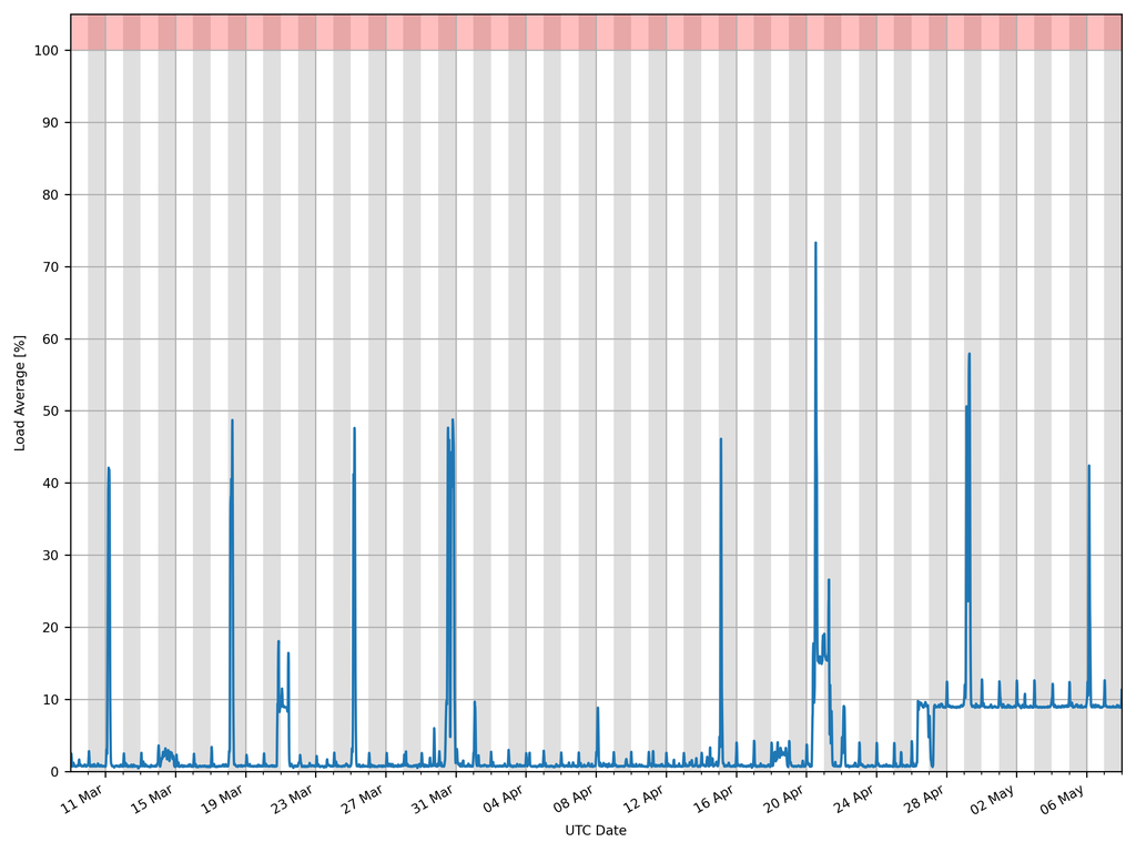
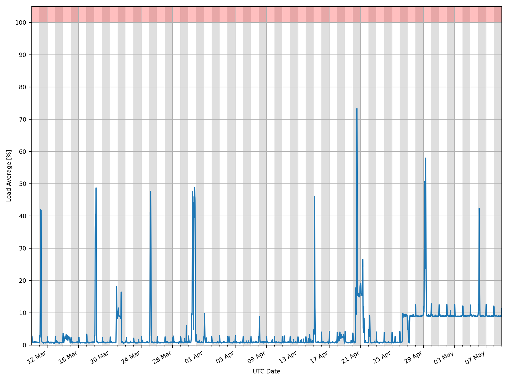
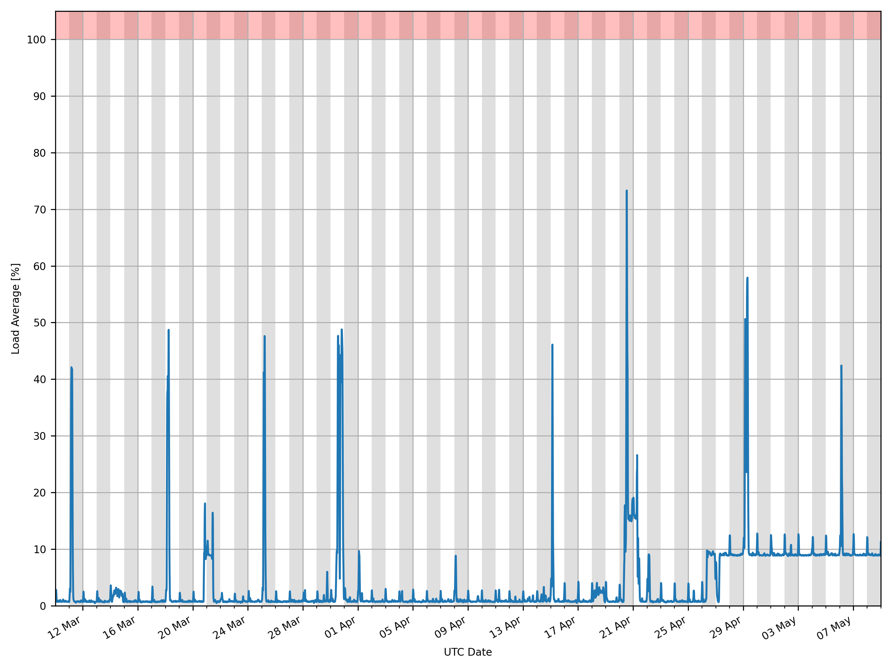
§3 Load Average Plot
Download:256 px × 192 px (0.0 Mpx; 20.1 KiB) 512 px × 384 px (0.2 Mpx; 44.8 KiB) 1,024 px × 768 px (0.8 Mpx; 90.1 KiB) 2,048 px × 1,536 px (3.1 Mpx; 200.7 KiB) 2,880 px × 2,160 px (6.2 Mpx; 154.8 KiB)
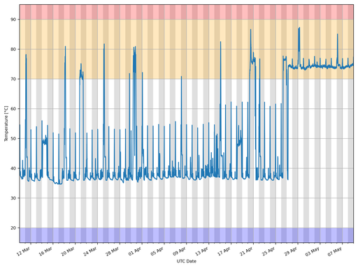
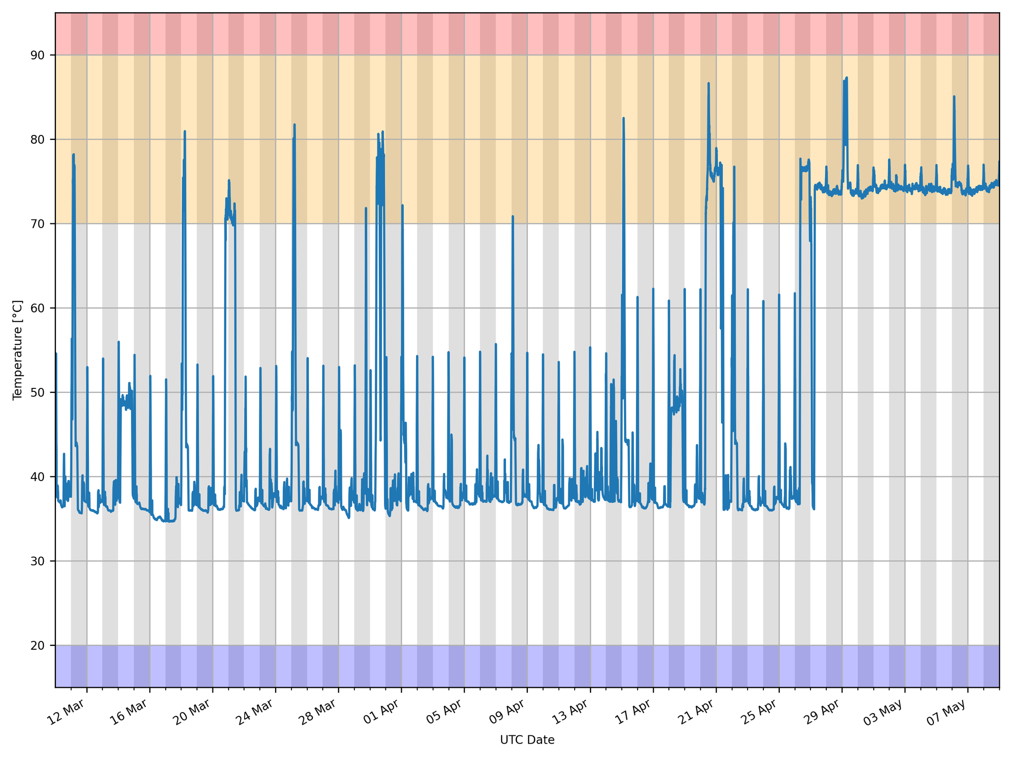
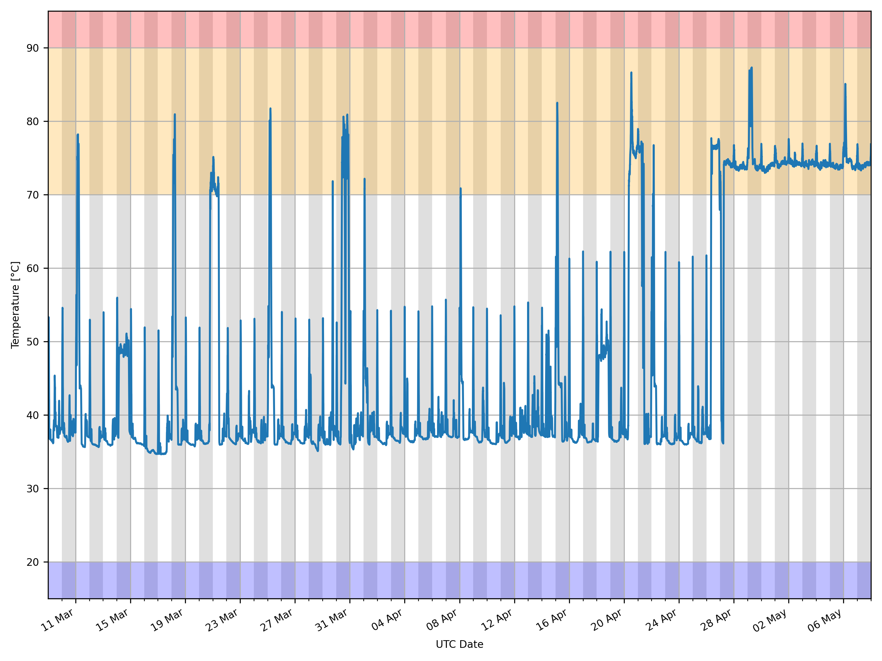
§4 Temperature Plot
Download:256 px × 192 px (0.0 Mpx; 27.8 KiB) 512 px × 384 px (0.2 Mpx; 61.9 KiB) 1,024 px × 768 px (0.8 Mpx; 134.9 KiB) 2,048 px × 1,536 px (3.1 Mpx; 296.5 KiB) 2,880 px × 2,160 px (6.2 Mpx; 246.1 KiB)
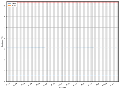
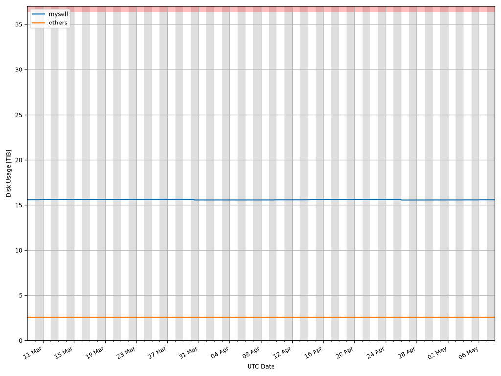
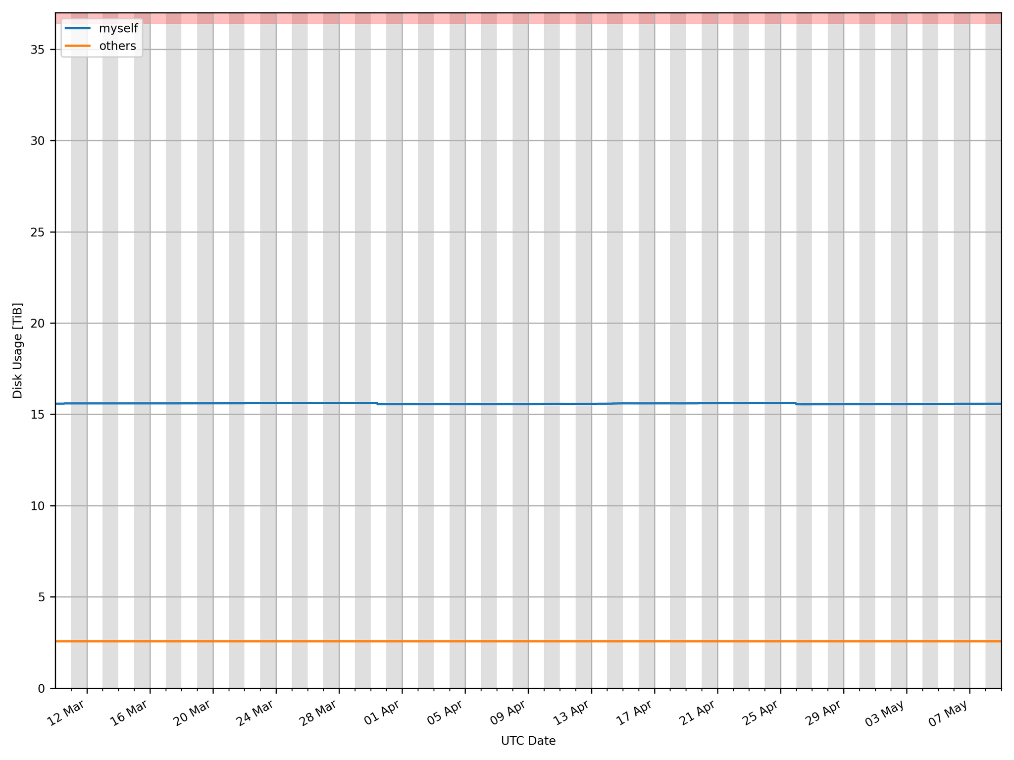
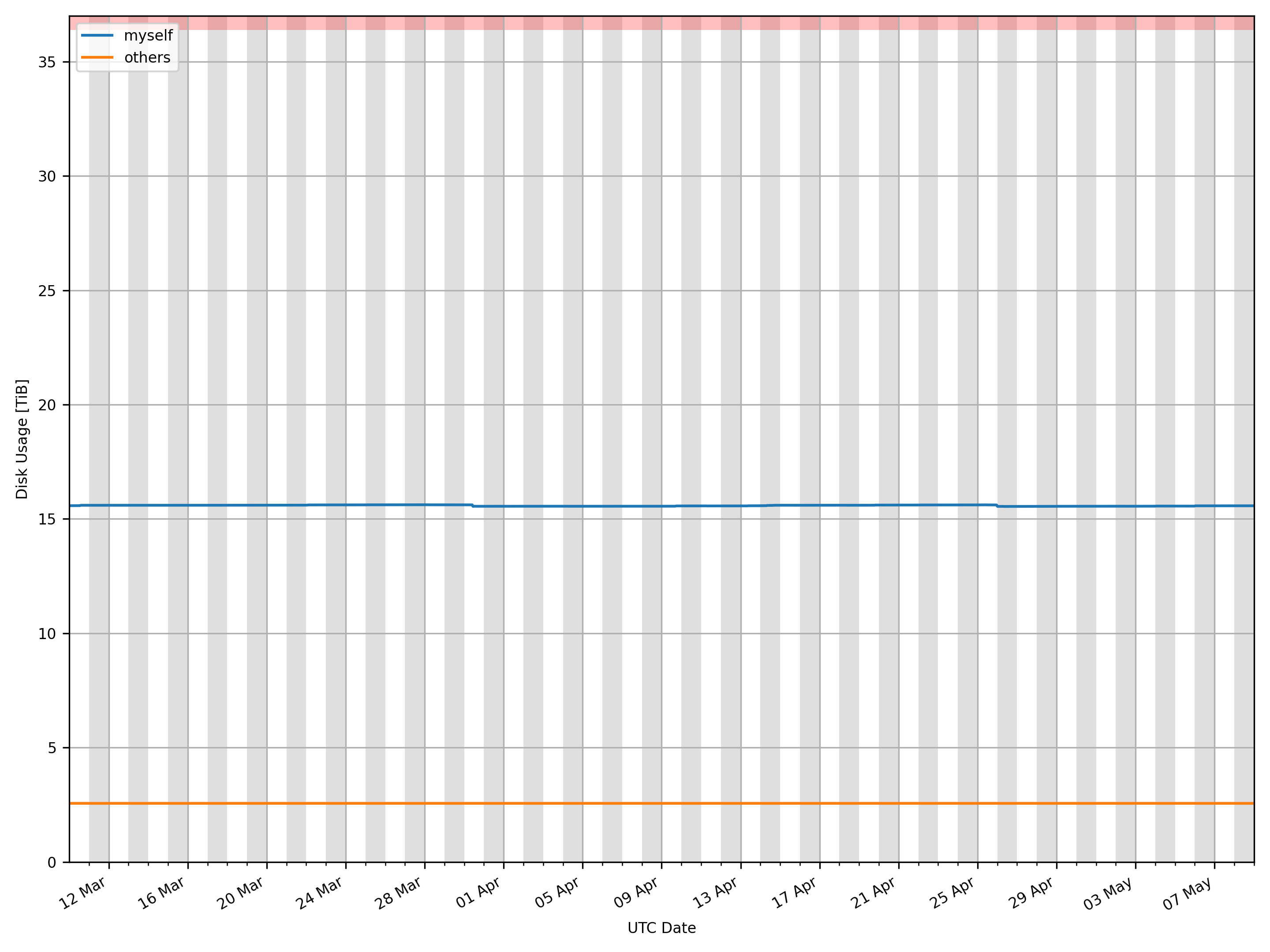
§5 Disk Usage Plot
The red region shows the limit of storage capacity.
Download:256 px × 192 px (0.0 Mpx; 13.5 KiB) 512 px × 384 px (0.2 Mpx; 28.2 KiB) 1,024 px × 768 px (0.8 Mpx; 54.1 KiB) 2,048 px × 1,536 px (3.1 Mpx; 107.0 KiB) 2,880 px × 2,160 px (6.2 Mpx; 78.6 KiB)
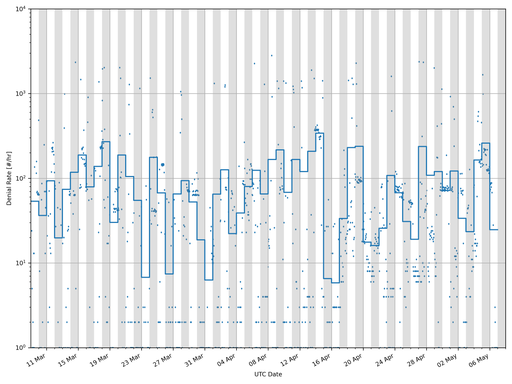
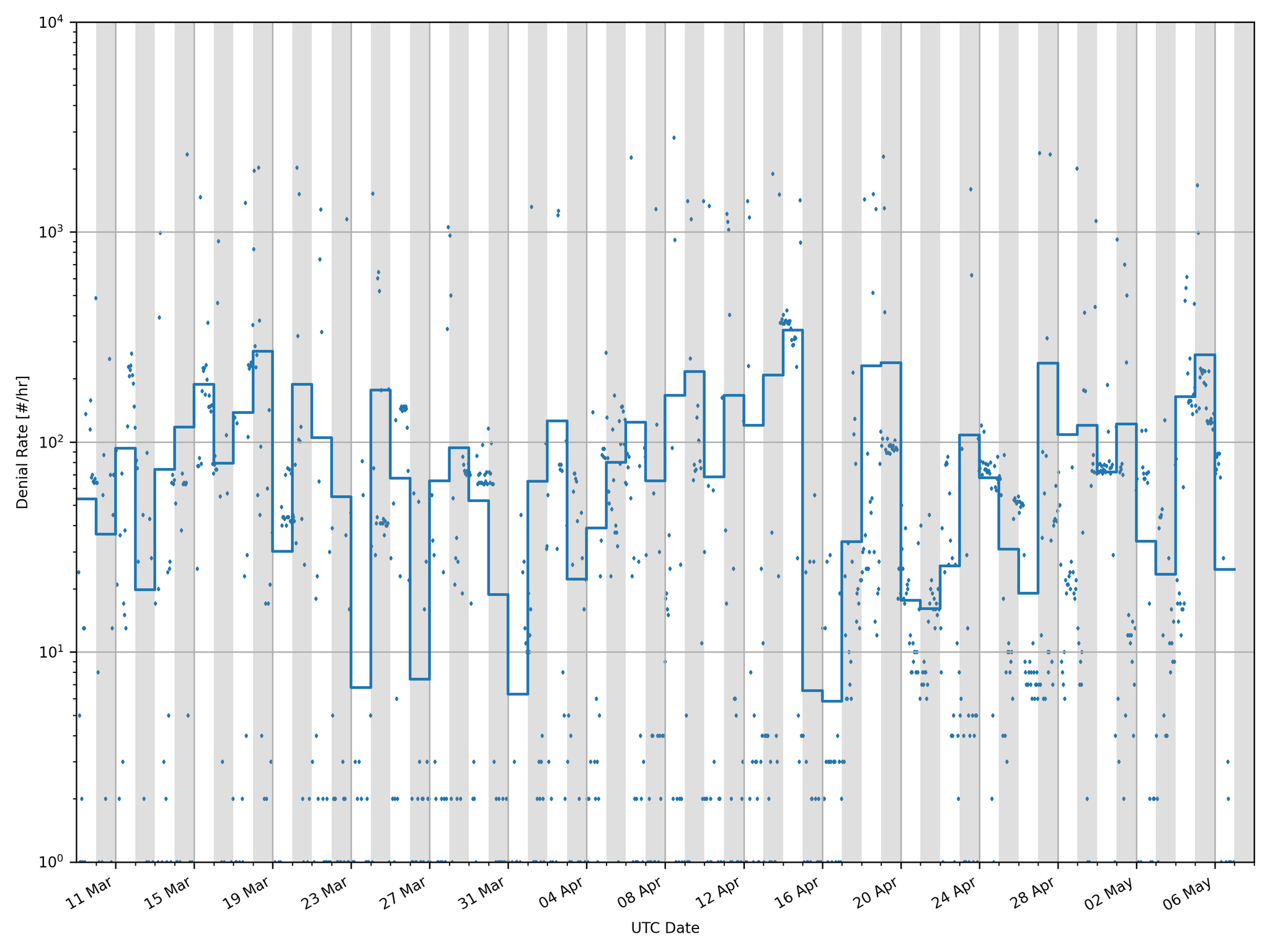
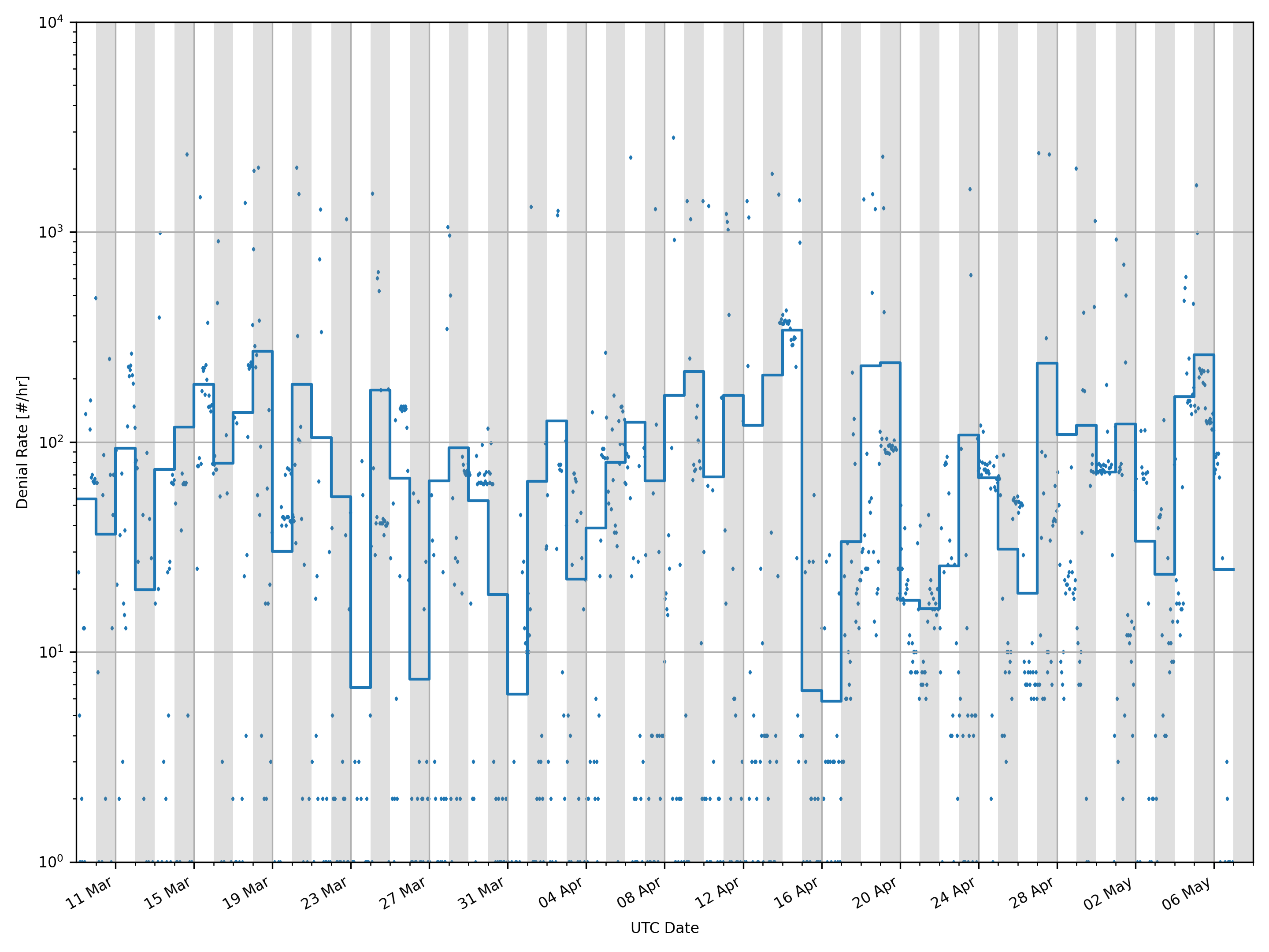
§6 Firewall Denials Plot
Note the logarithmic axes.
Download:256 px × 192 px (0.0 Mpx; 24.1 KiB) 512 px × 384 px (0.2 Mpx; 50.3 KiB) 1,024 px × 768 px (0.8 Mpx; 102.3 KiB) 2,048 px × 1,536 px (3.1 Mpx; 213.4 KiB) 2,880 px × 2,160 px (6.2 Mpx; 120.9 KiB)
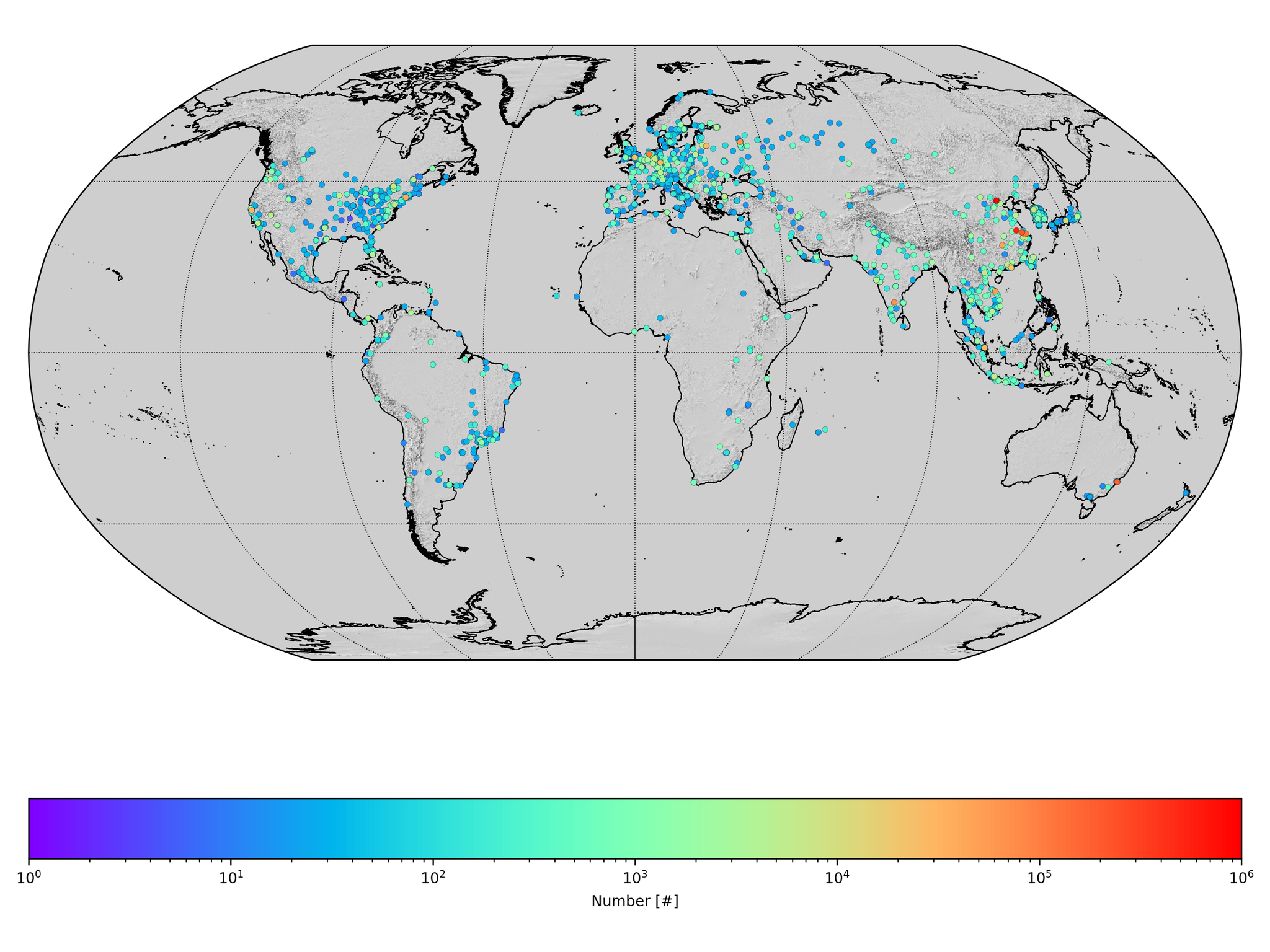
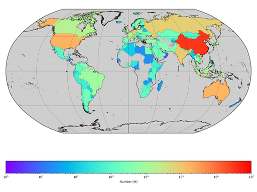
§7 Firewall Denials Maps
These maps are created using locations and countries provided by ipinfo.io . Note the logarithmic axes.
Download:256 px × 192 px (0.0 Mpx; 38.7 KiB) 512 px × 384 px (0.2 Mpx; 116.0 KiB) 1,024 px × 768 px (0.8 Mpx; 355.7 KiB) 2,048 px × 1,536 px (3.1 Mpx; 1.1 MiB) 2,880 px × 2,160 px (6.2 Mpx; 998.5 KiB)
Download:256 px × 192 px (0.0 Mpx; 40.2 KiB) 512 px × 384 px (0.2 Mpx; 112.7 KiB) 1,024 px × 768 px (0.8 Mpx; 310.2 KiB) 2,048 px × 1,536 px (3.1 Mpx; 829.9 KiB) 2,880 px × 2,160 px (6.2 Mpx; 738.5 KiB)
§8 Firewall Denials “Country Of Origin” Table
This table is created using countries provided by ipinfo.io .
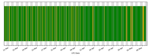
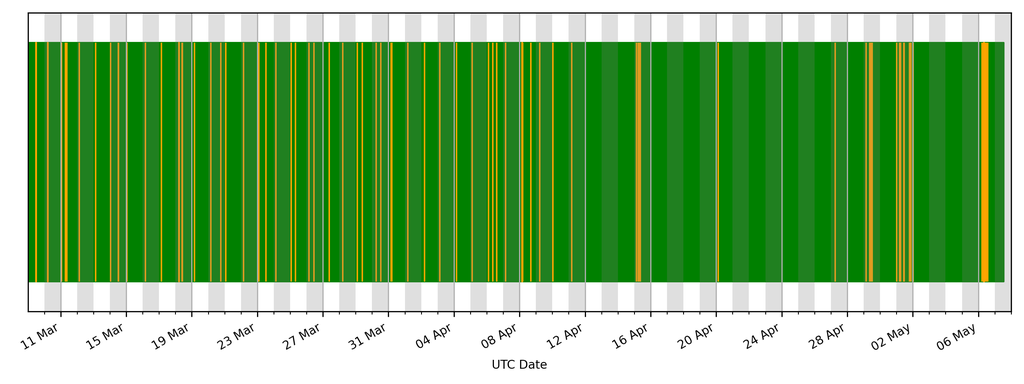
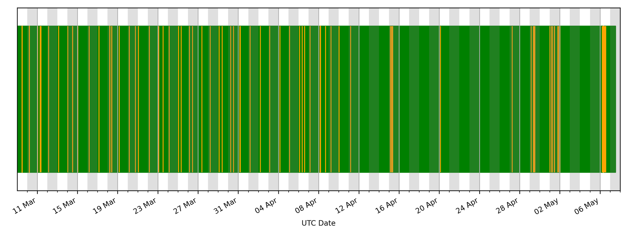
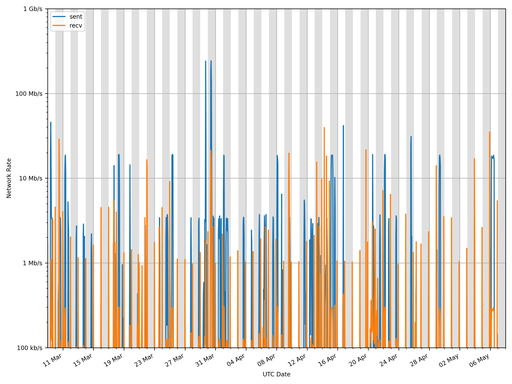
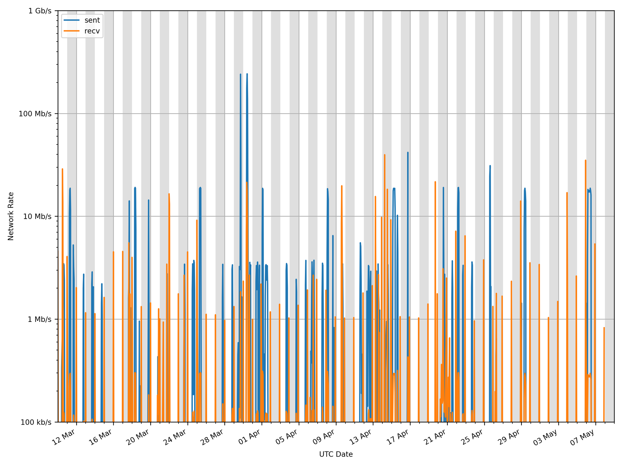
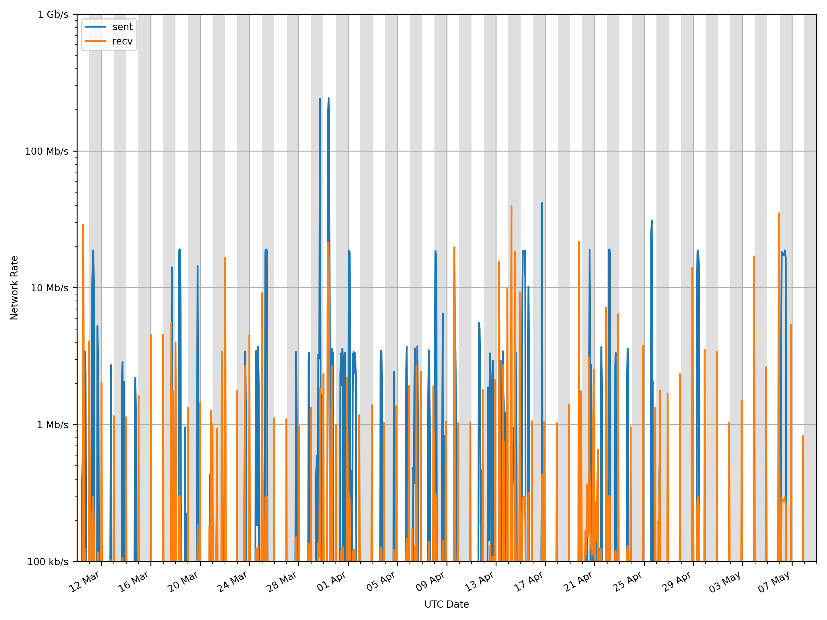
§9 Network Plots
In the first plot: green indicates full network access; orange is only local network access; and red is no network access at all. Note the logarithmic axes in the second plot.
Download:256 px × 96 px (0.0 Mpx; 8.5 KiB) 512 px × 192 px (0.1 Mpx; 15.2 KiB) 1,024 px × 384 px (0.4 Mpx; 27.8 KiB) 2,048 px × 768 px (1.6 Mpx; 58.2 KiB) 2,880 px × 1,080 px (3.1 Mpx; 39.6 KiB)
Download:256 px × 192 px (0.0 Mpx; 24.6 KiB) 512 px × 384 px (0.2 Mpx; 59.7 KiB) 1,024 px × 768 px (0.8 Mpx; 132.9 KiB) 2,048 px × 1,536 px (3.1 Mpx; 296.5 KiB) 2,880 px × 2,160 px (6.2 Mpx; 282.9 KiB)
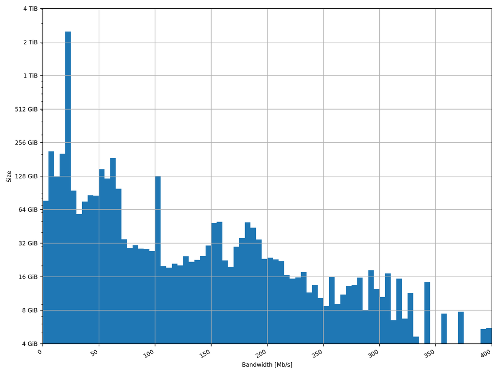
§10 Bandwidth Plot
The amount of data created as a function of bandwidth since May 2021. Note the logarithmic axes.
Download:256 px × 192 px (0.0 Mpx; 12.8 KiB) 512 px × 384 px (0.2 Mpx; 24.5 KiB) 1,024 px × 768 px (0.8 Mpx; 43.9 KiB) 2,048 px × 1,536 px (3.1 Mpx; 86.4 KiB) 2,880 px × 2,160 px (6.2 Mpx; 72.8 KiB)
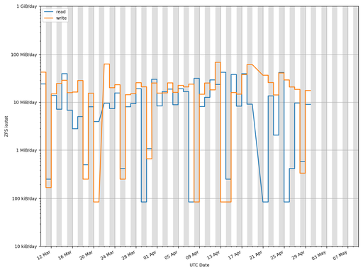
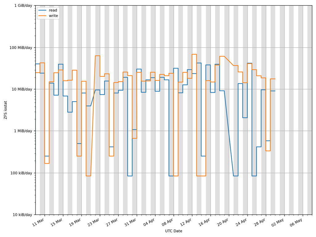
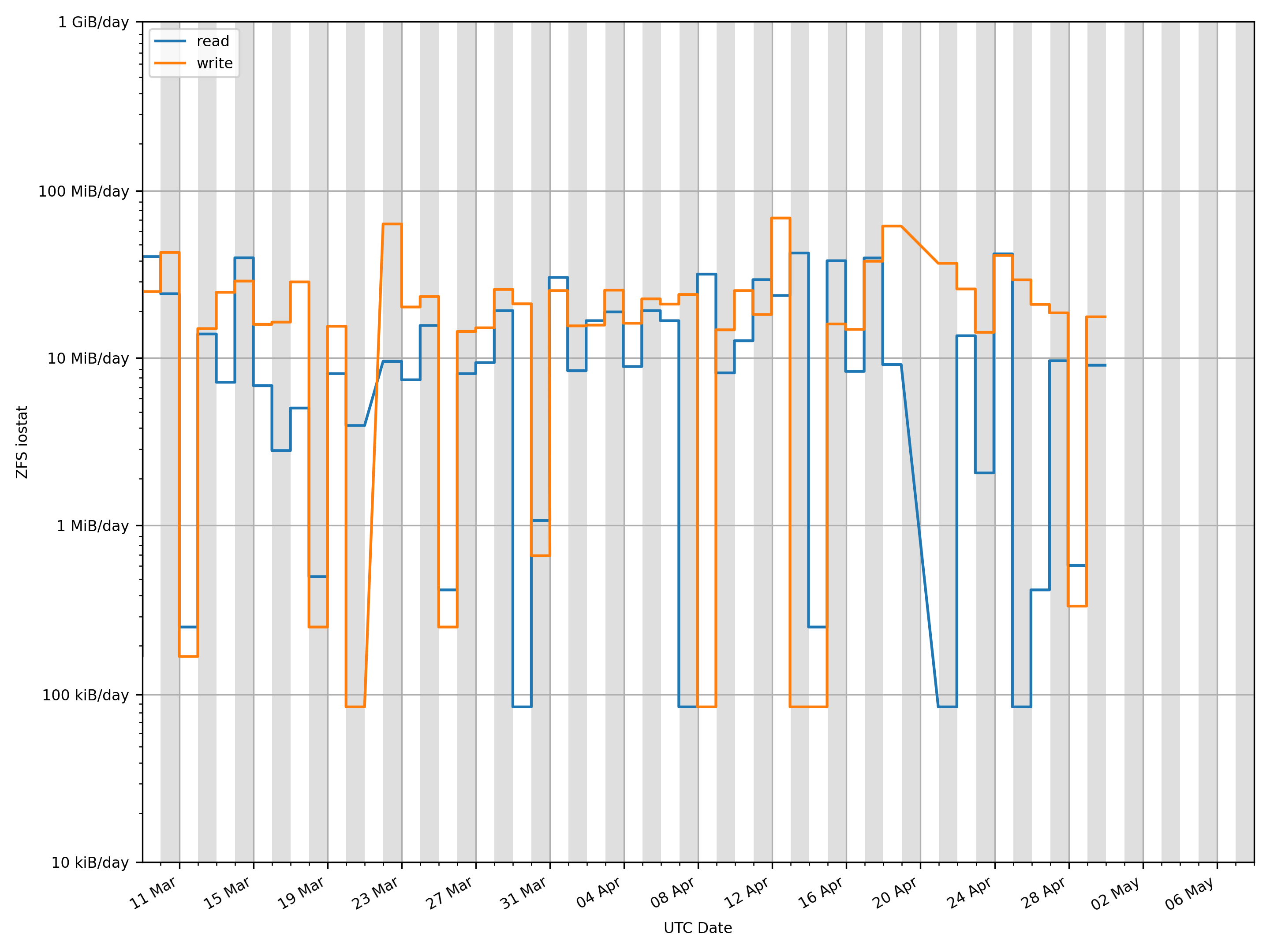
§11 ZFS iostat Plot
Note the logarithmic axes.
Download:256 px × 192 px (0.0 Mpx; 20.5 KiB) 512 px × 384 px (0.2 Mpx; 44.4 KiB) 1,024 px × 768 px (0.8 Mpx; 86.4 KiB) 2,048 px × 1,536 px (3.1 Mpx; 183.3 KiB) 2,880 px × 2,160 px (6.2 Mpx; 136.7 KiB)
© 2002 - 2026 Thomas Guymer


